Warning: Undefined array key "HTTP_ACCEPT_LANGUAGE" in /var/www/minitokyo/www/includes/common.inc.php on line 360 Help with Shadows? - Minitokyo

Help with Shadows?

This thread is closed for posting.

page 1 of 1 13 total items

elisadevelon

Retired Moderator

elisadevelon

The purple vamp

So basically, here's a sketch. It's quite huge so that if you want, you can download it and directly edit it.

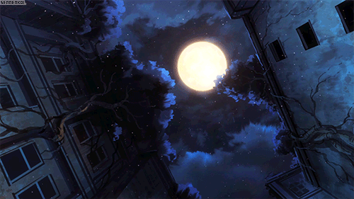
What I want to hear from you is your opinion on my shadowing. Whether the shadows are placed in the right areas, whether they look natural, whether I should add or delete a layer of them, etc. It will be a night scene and the source of light will be a huge (well, not really that huge) full moon partly behind the guy's head and partly in that area on the left with the empty window. Please concentrate on the guy, as I won't be using sharp shadows on the furniture or walls but only on him and he's the main focus. Like I said, if something is difficult to explain, show it to me directly by editing the image. I'm fine with that.

Of course, if you have anything else to add, I'll welcome any kind of advice. For example, I have a feeling his head is too big. Is it? Or not?

P.S. Please ignore the narrow line framing the image. It's there for me so that I know where the edges of 16:10 resolution are.

Thanks in advance! :)

Ugh, should be under Tokyo ghoul... Where was I looking when I tagged it? -____-

Angi

Retired Moderator

Angi

But it is not this day!

Tried to move to Tokyo Ghoul, nothing happened ._.
I'll ask first, does the moon will be the only source of light?

Signature Image
This day we fight!

Painter

Painter

Skull Master >:3

Could you please draw the moon? I can't understand whether it's in the left corner or in the middle. After that I'll try to give you all possible help :3
P.S. the sketch's cool :DD

elisadevelon

Retired Moderator

elisadevelon

The purple vamp

ok, HERE

I imagine it approximately like that and yes, the moon will be the only source of light.

Valuna

Retired Moderator

Valuna

Naughty Artist

@Angi: I think that happened before with tagging a thread. It was time ago though. I don't quite remember what the issue was.

@Elisa: The shadows seem fine. You've got a good grasp of controling light sources (it's not difficult once you get a feel of depth in images).

His head is indeed too large. It is quite common in anime that heads are bigger than they should be. I suggest you check how big his head is compared to the shoulders in normal images and with your own. You check it by copy/pasting his head from one shoulder to the other. The actual amount should be 3 heads fitting, but since it differs nowadays in anime/manga, you'll have to check if it follows that rule by comparing an original image from the series.

It looks great, tingles my walling senses to make something, but I will have zero amount of time for a little while ; ;

These beautiful, fragile days are reborn, unfaded
Signature
	Image

I don't think the head is too big...I think it's proportional to his body...
The shadows are really well done! just not sure about the lifted hand because of the angle but I think it's good!

Angi

Retired Moderator

Angi

But it is not this day!

Ok
It looks good, but I'd suggest add more shadows, since it doesn't have any other source of light, moonlight is natural and glimmer/weak/remote, so adding darker shadows would giev that tone. Tried to find you some references, had little luck x.x this, might give you an idea, there are like 4-5 shadows, also here, tho is an outside scene, but it has the moon in the upper center similar to how you positioned the moon and character in your wall, and you can get an idea where the highlights should be brighter and the shadows should be darker x.x.. hope that help a bit.

Signature Image
This day we fight!

Painter

Painter

Skull Master >:3

Agree with Valuna. Also it seems for me that his head is a bit asymmetric ._.

pandemonium91

Retired Moderator, Tagger

pandemonium91

The dutch angle strikes again! He is totally on the Titanic right now.
Inb4 disagreeing with everyone else and offering totally conflicting advice/opinions, lol.

It looks fine to me. The number of shadows you go with depends on how you'll approach the overall wall. If you choose to go with vectoring, I'd add at most 2 layers of shadows (note that I'm referring only to shadows, not shading in general - which also includes highlights); if you go with painting, the shadows will "flow" into each other so it'll be easier to get higher contrast with a minimal # of layers.

Didn't think his head was too big at first glance. The slightly exaggerated proportions fit the overall look.

If the moon is the only source of light, I'd move the dark shading on the armchair a bit higher on the armrests and keep the highlights a muted shade, closer to the base color. It depends if you're going for a more realistic effect (in which case duller highlights and shadows would portray fabrics better) or an exaggerated, metallic one (with the shading on the hair, though duller highlights would work in this case as well).

Also, you rush-paint better flowers than I normally wall. #jelly
And I hope that you're not going to copy/paste that godawful stock photo of the moon that everyone and their mom used back in 2007 c:

P.S. Eden Eternal is the bane of everyone's existence. For some reason, threads tagged under specific series default to being tagged under it.

If you can't handle me at my best, then you don't deserve me at my worst!

elisadevelon

Retired Moderator

elisadevelon

The purple vamp

Thanks everyone, I've edited it: CLICK

@Val: Yep, I use that technique for checking the sizes and that was also why I was asking. xD Well, In official art, they don't make his head so big and he looks more mascular. I made his head 95% smaller and widened his shoulders because I think the problem was I didn't make him robust enough. I hope that solves it.

@Val & DragonBlood: Alright, I kept most of the shadows as they were and just added some to the right hand sleeve because i felt like I needed to better distinguish how he bends his arm in elbow. The lifted hand - I needed to somehow cram it into the wall since I didn't want to crop the top of the mask he's holding. D:

@Angi: I want this to look more anime-style. So I don't want too many shadows "flowing" into each other like Pande said. And woah, that gif is beautiful (I wouldn't mind to reblog it :D ) but I have bad experience with using too dark colors so I think I'll only save this for the corners of the wall/room.

@Painter: I tried to play around with his facial features a little. Moved one of his ear, his nose, lips and made his eyes a bit smaller. Is it better now?

@Pande: Good, I want to go with vectors (well, not really) but it will look like it's vectored so as I said to Angi, I'll use fewer shadows.
Made his head smaller; I think it's more natural now?
The dark shading on the armchair moved a bit higher. I'll see about the colors when I start coloring it. I don't even know yet what color the armchair will be...

Still @Pande: What are you talking about? My rush-painted flowers are just a mass of unidentifiable fluffy objects now. I'm still thinking of turning them into roses as there are roses on the plate.
Ummmmm, if you're talking about these photos (or something similar), then I should probably keep it to myself that I use the images as the basis of almost every moon I place in my walls and then just crop or delete parts of the used photo to get a crescent and/or paint over and filter it to get more animated look and no one ever found out... Like, look here: >pretty obvious<, >used as part of the texture<, >texture again<, >blurred, painted over, edited< and >totally edited but yeah, still there<... please, don't kill me?

http://thumbnails106.imagebam.com/21775/542f5a217741038.jpg

pandemonium91

Retired Moderator, Tagger

pandemonium91

Yeah, with his head smaller it looks better.
If you search for Armchair on MT, odds are 95% of images are of red armchairs. You could mix it up by having it be green or cream.
The flowers make me think of those craft project flowers made from that soft type of colored paper that I can never remember the English name for.

@moon photo: this one is an offense on the same level as slapping someone's mum: if you don't have a damn good reason to do it, keep your hand in your pocket. Err, not sure where I was going with that. Anyway, it's an extremely common image, and chances are you won't see so many details while looking at the moon from down here on Earth. It would clash with the vectored everything else in the wall anyway.
In the examples you gave, it's not obscenely obvious, like here: 24358, 21729, 21660, 29465.

If you can't handle me at my best, then you don't deserve me at my worst!

Painter

Painter

Skull Master >:3

Much better now in general :DD

Using moon brushes is bad? D:

pandemonium91

Retired Moderator, Tagger

pandemonium91

Quote by PainterUsing moon brushes is bad? D:

No, if the moon ends up not looking out of place in your wall c:

If you can't handle me at my best, then you don't deserve me at my worst!

page 1 of 1 13 total items

Back to The Sandbox | Active Threads | Forum Index

Only members can post replies, please register.

Warning: Undefined array key "cookienotice" in /var/www/minitokyo/www/html2/footer.html on line 73
This site uses cookies. By continuing to browse the site you are agreeing to our use of cookies. Read more.