Warning: Undefined array key "HTTP_ACCEPT_LANGUAGE" in /var/www/minitokyo/www/includes/common.inc.php on line 360 Please evaluate the quality of my K Project wallpaper - Minitokyo

Please evaluate the quality of my K Project wallpaper

Tagged under Eden Eternal

This thread is closed for posting.

page 1 of 1 19 total items

Hello,
I'd like to know if my wallpaper is acceptable or not.

Spoiler (show)

http://alice666.deviantart.com/art/What-s-a-perfect-King-made-of-505552232
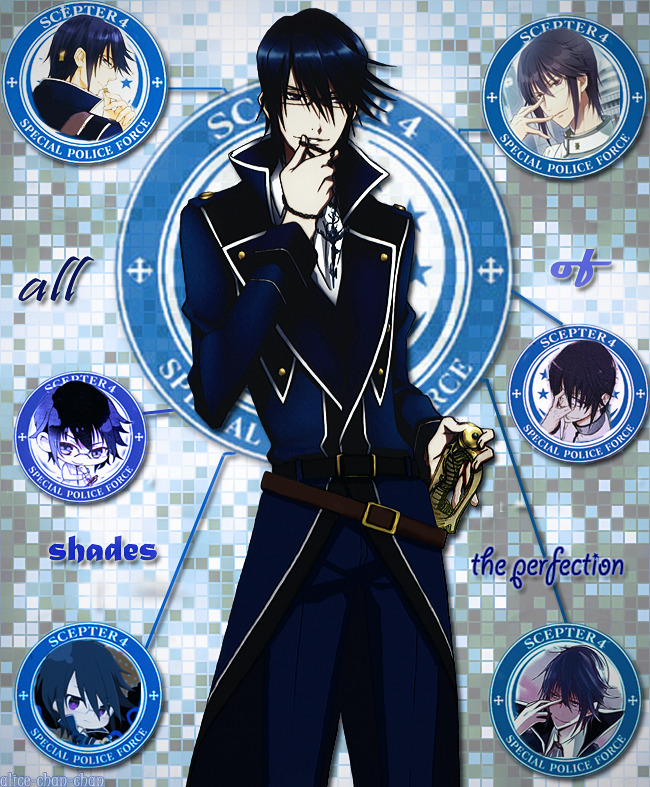
The main pic is made of this scan:
K Project#605211

and the official sketch by GoHands which is less cropped than the finished art (I combined them, colored the uncolored part, erased everything from the background and edited the resulting pic).
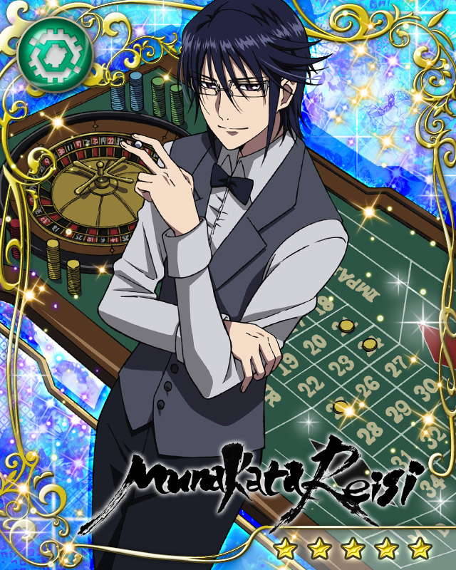
Small pics: CG cards which are free to download
http://40.media.tumblr.com/3129b276cb071cfcad2d496fdd9c8e03/tumblr_ncpwtpg8MA1szg1yno2_r1_1280.jpg
http://41.media.tumblr.com/01f13ff7c59c2ebb34298e9dae9ed1eb/tumblr_n7vfx7WaHm1szg1yno2_r1_1280.jpg
http://40.media.tumblr.com/c6043fbc4f8e2818fea35d3cb5a300c3/tumblr_mx2xtvqjNa1szg1yno1_r1_1280.jpg
http://41.media.tumblr.com/4c412eb0b3e03056c713f61f55bbdd18/tumblr_muajrzuhYR1szg1yno1_1280.jpg
also edited by me.
All the backgrounds including the ones of the small 4 pics are made with the help of these textures:
http://webtreatsetc.deviantart.com/art/Warm-Amber-Patterns-Part-5-151765604
http://webtreatsetc.deviantart.com/art/Seamless-Warm-Copper-Patterns-151009066
obviously also edited by me.
I don't remember where I found the scan with the Scepter 4 emblem but of course I erased its background myself.
I also used a texture that I can't find in the net right away (something textile-related), and some standard PS filters and actions.
I have a feeling that I've overfiltered the small pics and I don't really like how they look like now (seems that some artifacts have appeared or I am seeing things). This is not hard to change bc I have several multy-layered work in progress files that represent the previous stages of my work. But I am not sure that this is the only problem.
So, any ideas?
Maybe my wallpaper looks too primitive? Or the idea is OK but is not carried out good enough? Or something else?
If my WP is not acceptable I'd like to know if it is worth trying to change anything about it or it would be better to forget about it.
Hope to get some help and thanks in advance. ^^
P.S. I had used all these official arts in my edits on Tumblr before I made this wallpaper, so if by any chance someone recognizes them, yes of course my old edits and this very WP have the same origins. ^^

edit: I tagged this post with "K Project" but I can see some other tag instead of it and can't change it myself. O_o

edit: I've made a 2nd version, please look at it not at the 1st one:
http://alice666.deviantart.com/art/What-s-a-perfect-King-made-of-v-2-507927788
(all the scans, textures etc. are the same)

edit2: version #3:
http://i62.tinypic.com/2mrh4wo.jpg

current anime obsession: K Project (since 2012)

Valuna

Retired Moderator

Valuna

Naughty Artist

The quality itself looks acceptable. Although, I am not really one to judge it properly via a phone (unreliable pixels).

Sadly, what I am about to tell might end up you changing your wallpaper entirely, but it is the feeling I got from it when I had a look at it. The idea itself, is really nice. The execution kind of fails at it. Not trying to be mean or anything, it can be done so much better, even if you aren't a pro with the right directions.

Your overal effects is quite nice. The character render on the left looks decent, but I am doubting the quality. He looks really dark and what are those odd lines that look like scan lines?

What I can say; is that the composition is very basic. It is like a character introduction. I would make it less basic by either using a different main picture, one that is more dynamic or twisting him 45 degrees. I would go for a different pose and center it.

About the other pictures, it is kind of a collage. If you center the main picture, you can work your way around with the other pictures starting from the center. This will change the focal point to the center instead of through the entire wallpaper. Having a proper focal point makes it more pleasing to the eye and shows good composition.

Now, on to the text. The text is kind of "bad". I would choose for non-fancy text that would blend in with the picture so much better. Put them more in a playful matter, as it would be the best if you put the pictures around properly.

Problem here is, it is basic in the way that there is a normal pose char on the left, nothing special and things describing him in a very stale way. Just portraits that are all straight. Like I have been trying to point out, it is more fun closing those portraits together and twisting them a couple degrees here and there. Giving different shapes will work too and the text, should be just as playful. The background, it can stay the same. It is simple and boring enough that it won't distract being left like that. The style however, might clash a little.

As far as gallery acceptance goes, it is on the edge of deletion/acceptance. Depending on the quality of the pictures and rendering, it might just be good enough.

About the tagging, it is a reoccuring bug that still needs to be fixed.

These beautiful, fragile days are reborn, unfaded
Signature
	Image

Thanks for the detailed answer! This is very appreciated.

Don't know if you are familiar with this character (Munakata Reishi) but the thing is, the word "playful" is something that doesn't seem to correspond with him at all. x) He is the Blue King and the leader of a special police organization called "Scepter 4", a strict and very formal person. My idea was to show some less known aspects of his personality (being ready to gamble, trying out some sports etc) and make it look like some sort of a report/official data. Something like... a chart, I'm not sure how to put it. Maybe it would be better if I used something more interesting than plain shadowed photos, or turned the Scepter 4 emblem into a diagram...

As for the main rendered figure, it is actually made of several layers of the same pic edited in different ways bc I was experimenting with effects. Looks like I forgot to erase some extra lines from the lower layers. Since it is not just a render but a combination of a render and a sketch colored by me I had to edit it a lot so that the picture looked like something whole not composed of 2 parts. Of course I have many other versions of this pic, and it can also be changed more.

Here's my earlier Tumblr edit with the same main pic in use:
http://40.media.tumblr.com/71274048c05e9beeddd67339ba585d4f/tumblr_ngwfx4qUHw1sra23wo1_1280.jpg
The idea was similar but not exactly the same: some kind of a chart/diagram representing different shapes of the character (it was about different types of depicting him in offical media in this case). Would it be better if I used this composition for my current wallpaper? I'd still prefer to use the CG cards as the representation of Munakata's complicated personality though.

Sorry I don't quite understand what you meant by "The text is kind of "bad"". Did you mean the font that I used or the words ? If it was about the font, did you mean chosing something more plain-looking, like Tahoma or Verdana, since you said "non-fancy"? Or were you saying that my text is non-fancy and needs to be turned in something more interesting?

And I'd like to say just a few words about the main background. I made it so it ressembled a bit Munakata's King's aura which looks like lots of tiny squares of different shades of blue. Don't know if it really ressembles his aura as the result. =/

I also have a feeling that the textile texture that I put as the top transparent layer is unnecessary. It makes the main figure of the character too blurry and too dark. =/

What do you think? Should I try to make my "official report with charts and diagrams" look like a report that doesn't need explanations to be seen as a report? Or would it be better to abandon this idea?

current anime obsession: K Project (since 2012)

pandemonium91

Retired Moderator, Tagger

pandemonium91

Val said just about everything I was going to say. I'll add some tidbits below to put my two cents in as well.

Ehh, viewing it on a monitor the images you used look pixelated/low quality, especially the butler/waiter one. They look pretty big in the original scans so I'm guessing the pixelation is due to oversharpening.
The contrast's a bit out of whack too: the image on the left is darker than the others. I'd either make that one lighter or darken the others to the same level.

To avoid the basic collage look, try scattering the images around at different angles. Add swirls and geometric shapes around them. Have the big render in the middle, slightly off-center, and the smaller images behind him. or have him in the middle, with the logo behind him and the "cards" to his side, pointing towards him (those arrows). Your Tumblr edit looks better than the wallpaper layout, IMO.

Here are some fonts I recommend, particularly Everything Holiday. If you end up using swirls in the background like I wrote above, it'll look very nice. If you're looking for a less "playful" font, Walkway and Quicksand are pretty versatile. System/default fonts are almost never a good idea to use because they're so common that they don't mean anything anymore (and some are downright ugly no matter where you use them).

If you want to have a more serious side to the wall, stick to neutral geometric shapes like squares, triangles and hexagons. Futuristic/cyber-looking lines and effects can also be helpful to add in the background (example 1, example 2, example 3).

Re: thread tag: yeah, Eden Eternal tends to do that, nothing to worry about.

If you can't handle me at my best, then you don't deserve me at my worst!

Thanks a lot for your comment!
Yes, I think you're right and that pixelation came from overshapening and overfiltering, just as I suspected. Saving work in progress files is a really convinient thing. ^^
Actually I've already made a 2nd version of my wallpaper bc after reading Valuna's comment I decided to turn it into something more formal looking, like a presentation from a police database. So I changed the position of the pics, added a diagram, merged it with Scepter 4 emblem and tried to make the small pics look like browser tabs or smth like that. Since I had a thought of an official database I decided to use Terminal font as it looks quite formal and "computer"-like. But the fonts that you recommend look quite interesting, I'll think it over.

Anyway, that's how 2nd version looks like:
http://alice666.deviantart.com/art/What-s-a-perfect-King-made-of-v-2-507927788
and even if it is still not acceptable for MT at least I myself feel much happier having this on my desktop instead of v.1. Besides, working on this WP was fun.

The examples that you've included in your comment look really cool. I'm not sure that I am capable of making this kind of effects at my current level but at least it's worth researching. Thanks again!

P.S. Looks like it is more safe not to tag posts at this very forum at all if you don't want to find yourself in Eden, unexpectedly. ^^"

current anime obsession: K Project (since 2012)

pandemonium91

Retired Moderator, Tagger

pandemonium91

MUCH better! Though I'd remove the "Justice" part on top of the logo in the middle, it looks out of place compared to the rest.
Is there a way you can find a better quality Scepter 4 logo? If not, try blurring near the edges on the inside, or painting over the pixelated parts with blue/white.
Those are pretty much the only gripes I have with this at the moment. This version is miles better than the original~

If you can't handle me at my best, then you don't deserve me at my worst!

Thanks!
This logo is killing me... I only managed to find a slightly bigger version of it and edited it as much as I could.
So, how about this?
http://i57.tinypic.com/315bbjr.jpg

current anime obsession: K Project (since 2012)

pandemonium91

Retired Moderator, Tagger

pandemonium91

Can you find some way to make the bright parts of it brighter, like in the Tumblr version? Maybe by increasing the contrast.
Otherwise it's good to go.

If you can't handle me at my best, then you don't deserve me at my worst!

I used just the logo "as is" for the Tumblr version but in the wallpaper version I tried to turn it into a diagram. The logo is merged with a transparent pic of a diagram; if I make it more bright it starts to look like the S4 logo randomly crossed by several white lines bc the shades just vanish. Do you think that this element looks kinda off? I can either remove the diagram layer and leave the emblem, just like in my Tumblr edit, or remove the logo and leave just the diagram but I think it would be too boring.

current anime obsession: K Project (since 2012)

did you thought about learning vector art? In my Opinion its easier and looks better if you just vector it.the time you spend on effects and cleaning is much more then creating the outlines. Sorry i dont know which Software youre using maybe i overread it or something but if you try to make more wallpaper for the Community or youreself then you would have much more fun vectoring it and seeing youre progress layer over layer, there are great basic Tutorials on DA for GIMP (Freeware) and hotoshop.

About your Wallpaper i think that theyou should let the scans around the char. out and focus on the Main Char. alone. The BG isnt bad, simple and easy to overlook but its missing impact like a good Typo.

You dont need to merge the layers afterall the final version you save on the HDD will be automaticlly merged, if you still want to merge the just merge the layer you changed colormode or effects with a pure empty layer

Sorry if im a bit crappy in my gramma and everything ist been a while since i wrote in english. i hope i could help you even a bit, wallers getting more rare these days

Thanks a lot for commenting!

I tried vectoring several years ago but I just can't get to like it. I prefer erasing, overepainting and editing rather than outlining. I can't say that I am a waller actually, I just make wallpapers from time to time because I like to customize my own Desktop myself, not with the use of wallpapers made by other people (although sometimes I use them too).
Since I am a fan of Munakata Reishi I wanted to make a wallpaper that could reflect some of less known traits of his personality. K Project is a very short anime and this character doesn't have much screentime, but there are also different types of the related media (several manga series, light novels, audio dramas, online card games etc.) that reveal more information regarding Munakata. This small pics in my wallpaper originate from the card game. They show Munakata as much less formal and strict person than he is known judging by the anime. That's why they all are very important and I don't want to leave them out. Anyone who has watched K Project could possibly use this WP as a quick guide like "get to know Munakata Reishi". ^^ Not all people who love K Project read manga, ranobe and other side materials that are also canon. It could be useful for them to know more interesting facts about this character. ^^

As for the instruments that I used when making this wallpaper, I worked in Photoshop with the help of a Wacom tablet. This thing is really great when you need to erase or overpaint something... But I've bought it just 2 weeks ago so I am a little bit not used to it. At least I am used to Photoshop. ^^

Ah, and I don't really merge all the layers, I meant that the diagram behind Munakata-san is made of several layers that are interlaced (3 layers actually: the police logo, the diagram and a blue circle bc the diagram is not blue enough).

current anime obsession: K Project (since 2012)

well in the end the most important thing is that youre happy and satisfied with your own work, if you dont want to use Vector then its fine the only advice i can give you there is, look for more tutorials regading special effects get ideas from other Wallpapers wich are similar to your style.

How about working more on some color modes or making the the wallpaper monochrome expect some parts like Hair and eyes or something like that for more originallity.

Some duplicated layer of the scan with a good blur effect and changed color mode sometime give the wallpaper also more impact ( I love Intense Colors! XD)
Also why not adding a title over the char in some great font and effects to it, i just think that your wallpaper is kinda boring in the Background, those Mosaics are nice for starters but adding some more deepth to it would surley make a huge change in the Atmosphere.

Im not that great with extracting so i learnied Vector my knowlege about your kind of wallpapers are kinda small.
PS: Youre a waller since you making wallpapers and trying to improve youreself and youre quallity of your Walls so dont give and good luck

elisadevelon

Retired Moderator

elisadevelon

The purple vamp

All right. Val and Pande have already given you quite a lot of advice so I'll try to keep it short.

1. Please, use fewer filters/effects. I'm serious; you use too many and the overfiltering makes your image look bad. Sometimes even 3 filters is too much already. You can try to use as many filters and effects as you like to see how your image will look after that but! if you like the result, try to recreate it with as few filters/effects possible. The more of them you use, the more will the quality of the image drop.

2. Like Pande observed, the 4 small images of Reishi look like you sharpened them too much. The main image really is too dark. You should make the render brighter or search for a completely new brighter scan. The edges are a bit jagged. Again, either repaint/vector the scan a-new or choose one of better quality. If you have a tablet it shouldn't be a problem for you to learn to either paint or vector.

A tip: If a render has some white parts around the lineart like your Reishi and you want to get rid of them easily, use the Stroke effect for layers and set it to "inside". It will cover up the (white) imperfections.

3. I'm not sure where and how you got the lower part of Reishi's body (I admit I didn't read the entire previous conversation in this thread) but it's different from the upper part. The graininess isn't so obvious and some of the soft lights on his uniform are missing. I'm mentioning this because it's too obvious to me. :/

4. The BG isn't bad for a beginner and I guess it could symbolize Reishi's power, but it somehow reminds me of tiles on bathroom walls. xD It's not really bad but it isn't anything amazing either.

5. The Scepter 4 logo... is pixelated. Your wall's resolution isn't very high so why not search for a smother logo of Scepter 4? Look here! I think this one would do the job. If you don't like it because it's transparent inside, you can create a layer beneath it and fill the transparent parts with color; then merge the two layers together. Annnnd, then once you decide the colors for the logo, I would use the same colors for the lines leading to the four Reishis. Kind of like you did in the tumblr edit so that it seems that the llines are coming out of the logo. Also, make the lines (the ones framing the 4 images as well) thinner and discard the Drop Shadow effect. It's not really needed there. You could use Outer Glow instead to make the lines shine and create an impression of Reishi's power again. I'm sure it would make the wall more interesting.

6. Oookay, now my favorite part. Resources. Don't be afraid to use more resources. Since it's a wall with Reishi, I would maybe use some tech brushes for the BG. They look really cool and I'm sure you'd find a set or two which resemble his power and which you'll like if you google a little.

Sorry, I didn't manage to keep this short like I wanted. D: OH mY, it's not short at all. x__X

To Shimazaki:
Thanks again for commenting. I'll take your advice into consideration, especially your words about adding a title. ^^
Also, thanks for the encouragement!


To elisadevelon:
I agree that in the 1st version I used too much filters, overshapened the smaller pics and made the main pic too dark. And of course the logo was pixelated, I couldn't find any scan of a bigger resolution. =/
But in the 2nd version I discarded a great part of the filters and changed the logo to a better version, although not very big. If you still see the same problems in my 2nd version then I don't know what to say. %) Maybe it depends on monitors that you and I use but nothing looks pixelated for me when I look at the 2nd version of my wallpaper and I can't see any big problems with the main pic. The only thing that Pandemonium had critisized in my 2nd version was the logo but I changed it too and thought that all in all my wallpaper became OK. =_=

The lower part of Reishi's body originates from a sketch of the same art drawn by GoHands but less cropped. I colored it myself trying to follow the colored "tips" left by the GoHands artists so it lacks some special effects like the soft lights, I just don't know how to make them. And I can't say anything about the graininess of the upper half bc it doesn't look grainy on my laptop screen. =/

Thanks for proposing the brushes, that could really fit the picture well. And as for making the lines (including the frames) thinner I've already had some thoughts regarding this matter although I haven't thought about discarding the shadow effect and applying the glowing effect instead. That could be a really good idea.

Thanks for proposing another version of the S4 logo but are you sure that it is free to use? It looks like a vector made by someone. When I was looking for the logo earlier I came across some vectors of it that required crediting the owner so I avoided using them. I just can't imagine a good example of putting the vector credits somewhere on my wallpaper. =/ Wouldn't it look too overcrowded by the credit text?

To conclude, I'd like to say that I can work on lines, effects and brushes just like you suggested but I'm not sure about the main pic and the logo. Also, I doubt that I can do something about the smaller pics, their source is far from being of a high quality. If you insist that they still look pixelated after I discarded most of the filters then I'll have to give up. I don't feel like trying to vector these 4 pics and there's no better sources for them.

current anime obsession: K Project (since 2012)

elisadevelon

Retired Moderator

elisadevelon

The purple vamp

Yes, when I view the image on my laptop a lot of the graininess and pixelation disappears (which is most probably due to the fact I cannot change the contrast here) so I guess you're right about monitors. Reishi doesn't look so dark now either but on my laptop, the entire image is missing some more contrast which I believe either Pande or Val had mentioned as well. Well, I can't say which would be the 'correct' version here. I wish I could merge the two views together... but I guess I can't have everything, and since this is your work you should decide whether you are satisfied with it now or not. I think it could use some more editing, though.

I see. the lower part does look good in terms of anatomy but I was almost sure it was made by you because the lines look a bit shaky and like I said, the soft lights aren't there. If you'd like to add them, you can simply paint over the basic blue with a slightly brighter color. I wouldn't advise you to use the Dodge Tool for this since the cloak is so dark. It wouldn't probably turn out very well.

Unfortunately, I couldn't find a source for that logo I linked. Hmm, too bad. I wonder if there are other high-quality vectors of this thing because my quick search didn't find any other good ones.
Oh, and in any case, to "credit" someone doesn't mean you have to slap their name directly onto your art. That's what descriptions are for. :) You can list your resources there, mention where you found them, give the links, and say who the artists (owners) are. Likewise, even if you decide to use some of those Tech brushes, you won't probably write the name of the person who created them onto your wall, will you? It would be kinda stupid to cover the image with names and and links. :/
And actually, if someone states somewhere that you should credit them for using their work, it basically means they expect others to use it so you shouldn't be afraid to.

All right, work on the BG if you like my ideas. I'm glad at least some of them inspired you. :D
Aha, I thought the images came from scans. (Yes, I apologize for not paying attention again; I suppose you linked them before?) Well, if the originals are so small, you can't really do anything about them, that's true. So, focus on the BG effects then. Good luck! :) You're persistent and I like that. I'd be scared if I received such long responses in my Sandbox threads xD

pandemonium91

Retired Moderator, Tagger

pandemonium91

I think it's fine to have a break from vectoring. I remember back when it was still fairly novel and only a few people did it well, with blending and textures being the norm. Now it's the other way around because a lot of people know how to vector (or learn fast, if they don't).

The logo is OK to use, I'd say. It's extremely simple, anyway, and not an original creation. As long as you say you didn't make it ("Credit to whomever made this vector"), you should be fine.

As long as you're happy with your work I wouldn't stress about it too much. Sometimes you feel like making something for yourself, not a work of art to hang in the living room ^_~ It's good enough to submit to the gallery right now; of course, you can still work on it if you want to.

If you can't handle me at my best, then you don't deserve me at my worst!

To elisadevelon:
Thanks again for all of your suggestions! I tried my best to take them into account when I was working on the 3d version of my wallpaper.
Here it is:
http://i62.tinypic.com/2mrh4wo.jpg
I used these brushes, this person's vector of the S4 logo and the font recommended by Pandemonium (since Shimazaki suggested to add a title over Reishi's head).
I also changed the thickness of the lines and redrew the diagram (the layer under the logo) again bc I dind't like it. I'm not sure if the glowing effect looks good but I tried to make it correspond with the color of Munakata's aura.
I decided to replace all the 5 pics with some earlier versions of my edits (even less filters applied + a little bit other way of editing of the main pic, just like in my Tumblr version). I tried to add some soft lights to Munakata's uniform... and now I think it looks even more weird. =/ Idk.
Ah, and after several hours of editing I had a thought that this wallpaper needed a painted cursor in the corner to make it look more computer-like. I hope this tiny thing doesn't look too out of place or distract too much.
So, what do you think?
As for me, I have a feeling that this time I have created something rather messy and it reminds me of an unbalanced witch's potion. ^^'
P.S. The sources of the small images are CG cards. They are not only small but also quite ... artifacted. No surprise that you didn't notice them, I had moved all the text of the description under the spoiler cut bc it had become too big. You can have a look at the original pics if you are interested, just click the "spoiler". ^^

To pandemonium91:
I just don't like vectoring. This is not my cup of tea. =/ But I enjoy most of the other types of editing so I sometimes make wallpapers and edits for Tumblr.
The person whose vector I used in my 3d version of the wallpaper has these words in their original post: "Just please dun remove credits". I hope it's Ok just to link back to their post bc I don't want to offend anyone.
Can you please take a look at the most recent version of my wallpaper (this comment, the link in the beginning)? If possible, I'd prefer to submit it rather than v.2. ^^

current anime obsession: K Project (since 2012)

elisadevelon

Retired Moderator

elisadevelon

The purple vamp

Ahhh yes! I think this is definitely an improvement! Wow!
I love how you incorporated the brushes in the BG! They give the BG a fresh look. I'm also satisfied with the Outer Glow effect (although you could use it more sparsely) but in any case, I believe the glow was a good choice. It helps add more contrast to the image and makes it more vivid. :)
I like this vector of the logo, too, and I'm happy you found one that has a reliable source for credits. ;)
The font suggested by Pande is really nice (*downloads*) and I think the text blends with the rest of the image quite well. Neither does the cursor look out of place. It's small and doesn't disturb the image so it's fine. I actually like that idea of putting it there.
About Reishi's cloak - your lights aren't perfect but not that bad either. I'm sure you'll get a better grasp of painting after you make more walls and use your tablet more.
All in all, you did a good job. It might not be the most amazing wall ever but I'm proud of you for not giving up and taking all the advice you received into consideration. I hope you learned something new and that you'll grow as a waller! Keep it up! :)

Thank you very much for helping me! I am happy to hear that you like what I have made. ^^
I'll try my best to learn and level up more.

Oh, and since you like the font recommended by Pande-san I think you need to take a look at the others, also suggested by Pande-san:
http://www.fontspace.com/category/swirly
these fonts are also quite interesting. ^^

current anime obsession: K Project (since 2012)

page 1 of 1 19 total items

Back to The Sandbox | Active Threads | Forum Index

Only members can post replies, please register.

Warning: Undefined array key "cookienotice" in /var/www/minitokyo/www/html2/footer.html on line 73
This site uses cookies. By continuing to browse the site you are agreeing to our use of cookies. Read more.