
Here is my almost complete vector of Arumi from Magical Shopping Arcade Abenobashi
any tips and stuff would be helpful :D
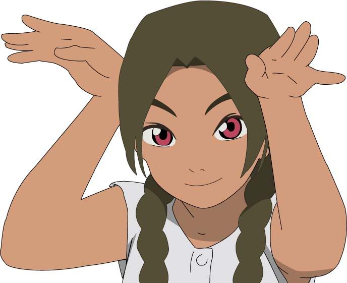
Edit:
here is the original screen for future reference
This thread is closed for posting.
page 1 of 1 11 total items
Here is my almost complete vector of Arumi from Magical Shopping Arcade Abenobashi
any tips and stuff would be helpful :D
Edit:
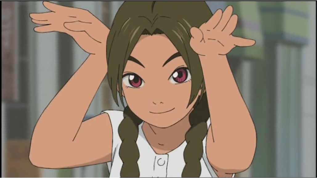
here is the original screen for future reference

Hi there great work sofar ^_^* I would take a look at the left arm though. Seems to be a little out of proportion. The rest is really good, especially the face :)
Keep it up!
Those who dream sweet dreams forget the pain of yesterday
tip: when you outline something, you outline *everything* except for shading.
ie. outline her hair thanks.
On that note you need some more shades on her face, hair and stuff. It's kinda flat and 2D.
Also, you don't have to vector exactly the same as the original... if anyone got that impression then that's silly. Give the girl some eyelashes and colour on her lips. She'll be happy :)
Otherwise the lines are pretty clean and it looks quite good :)

Misa|Virtuoso and Legend of W.A.R - UA|Most coordinated Legion of W.A.R
MINITOKYO-WIDE KNOCKOUT
WALLING COMP: LAUNCHES MARCH 2010. ONE WINNER. ONE PRIZE.
ADD ME TO YOUR FRIENDS <3
Unfortunately I'll have to agree with misa on the outlines. Either you outline everything or nothing, I don't think you can have a happy in between. Your vector does seem a little flat, the only answer to that is more shading. Also an especially picky point and I may be getting too picky is that I can see where your path lines meet up, but a little tweeking with the convert point tool will fix that up. Great effort though vectoring isn't an easy option, courage T_T
Update right here:
Hopefully its good, and if anyone is willing can you say add shade and stuff, ill give you the .ai file :D

well not bad at all, but i think it miss some shadows and the hands looks a little weird but it is really good, keep it like this ;)

You might want to outline here hair. the braids blend and take away from the vector. Some of the lines on the hair could be smoothed out as well. However, since its still a work it progress keep up the good work.

www.transluscent.net/perspective/
Gain a little Perspective
Hair needs outlining too and don't do outlines as a strokes - make outlines a shape with varying width, the vector will be less boring then.
Build a man a fire, and he'll be warm for a day. Set a man on fire, and he'll be warm for the rest of his
life.
--Terry Pratchett
I think the hair needs more outlining (they look weird like that) and I think you should host the full size image
somewhere so that we can see the real thing and then truly give comments on it, small size image doesnt really do
justice you see...Her right hand needs more outline on the fingers too I think...
Hope that helps :D

I don't think the quality of this vector is your fault, it is just because you are using Photoshop instead of Illustrator to make it. You can see it by just looking at it.
I suggest you download a trial version of Illustrator, and work with that alittle bit to see if it works better.
Have a look at the original in the link in first post
page 1 of 1 11 total items
Back to The Sandbox | Active Threads | Forum Index
Only members can post replies, please register.


