Uh, hi there, saw your doujin, and was going to comment, but then I saw you'd made a wall from it... So why waste
my time and effort, eh? ^_^;;
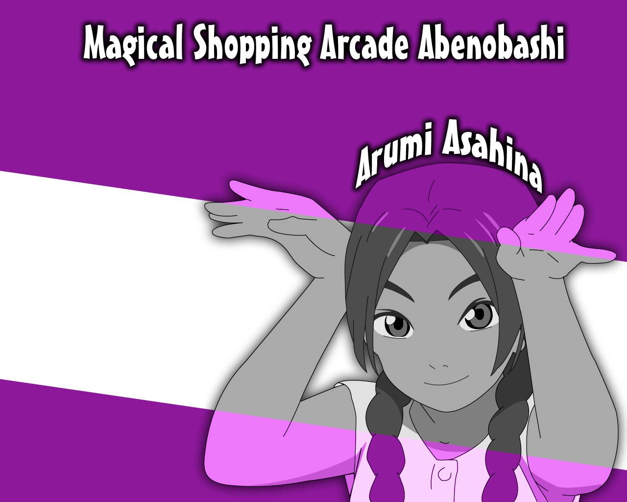
Doujin :
Err, no offence, but there really isn't enough shading on her... She looks very 2D because of that, and because
she's partially shaded [i.e. hair], she looks quite odd. You should add more shading to bring out the contours in
her face, and uh, shadows occur behind where the light is coming from... I'm assuming the top because that's
the way your current bits of shading are suggesting. Therefore, where her hand curves, there should be shading
underneath... Also, there are areas underneath her fringe which need to be shaded, considering the lighting
conditions.
The weird glow you put around her... Or, should I say, shadow... Because it's dark. It doesn't suit the image,
as well as looking lazy, and rather silly. Most shadows don't work that way. And, you've done a vector of a
doujin. Don't shift between cell-shading and soft-shading... It simply looks lazy.
Choice of Colour :
Sorry, but I'm not a fan of greyscale. It's good for the Gothic feel, and if you vary your shades of grey to
include hints of other colours... But this just looks like you took your doujin, changed the colour mode to greyscale...
Turned it back to RGB, and did the purple bits. I agree with Misa, it looks lazy.
Also, the focus should be on your character, not the bright purple edges. Therefore, if you wanted to create this
effect, the colour would have worked better on the character, in order to create a focus on the character, rather than
the edges of the image. And that shade of purple is just... Wrong. It's such a wannabe dark purple... And the light
purple... It's... A very weird shade. It's verging on pink. Maybe it's just because I like dark purples
[<3 Romans] but I really don't like this shade.
Moreover, huge areas of white are horrible. White space is really only good when you're designing a website or
program [<3 white space] but it doesn't work very well on wallpapers, because wallpapers don't ask for
consistency, they ask for originality and experimentation.
Background :
Well, there's no background to this really. There's a lack of tecture, lack of movement, lack of interesting
features. It's simplism taken to the max. It's just plain boring. I don't care what you do, grunge the
background, put some shapes, do some abstract art... Fill it with something.
Text :
Horrible. Big. White. Painfully contrasted with the black. Text. That's it. There is nothing else to say about it.
It's chunky, doesn't go with the feel of the image... The outline of the vector is relatively thing, make your
text match it. Because you text should integrate with the rest of the image to reinforce your message, rather than stick
out like a pig in a candy store... [Wait, do pigs stick out when they're in candy stores? @_@ Okay, bad analogy,
but you get the idea]
Useability :
If I were marking this, I'd give you a point for putting the character on the RHS. But Mac'ers wouldn't.
Fun. Otherwise, the colours really put me off, and I couldn't stare at the weird clash between white, black, purple
and grey... So basically, I probably wouldn't use this on the desktop. Also, because it's so bare, if I did,
I'd probably remove it after about 10 minutes because it's boring.
Overall :
I don't know what to say... I think the vector would look nicer in colour, and maybe the background in grey, for
the contrast... But you really have to make those decisions for yourself, as an artist.
Good luck, and hope that helps,
Tevi


