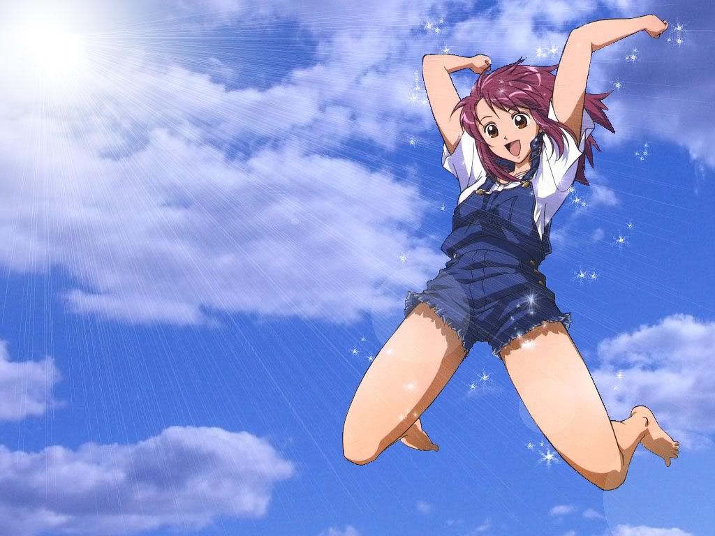
i like the colour tone of the 1st version, but yeah, it's too empty. and sparkles no good. sparkles too cliched.
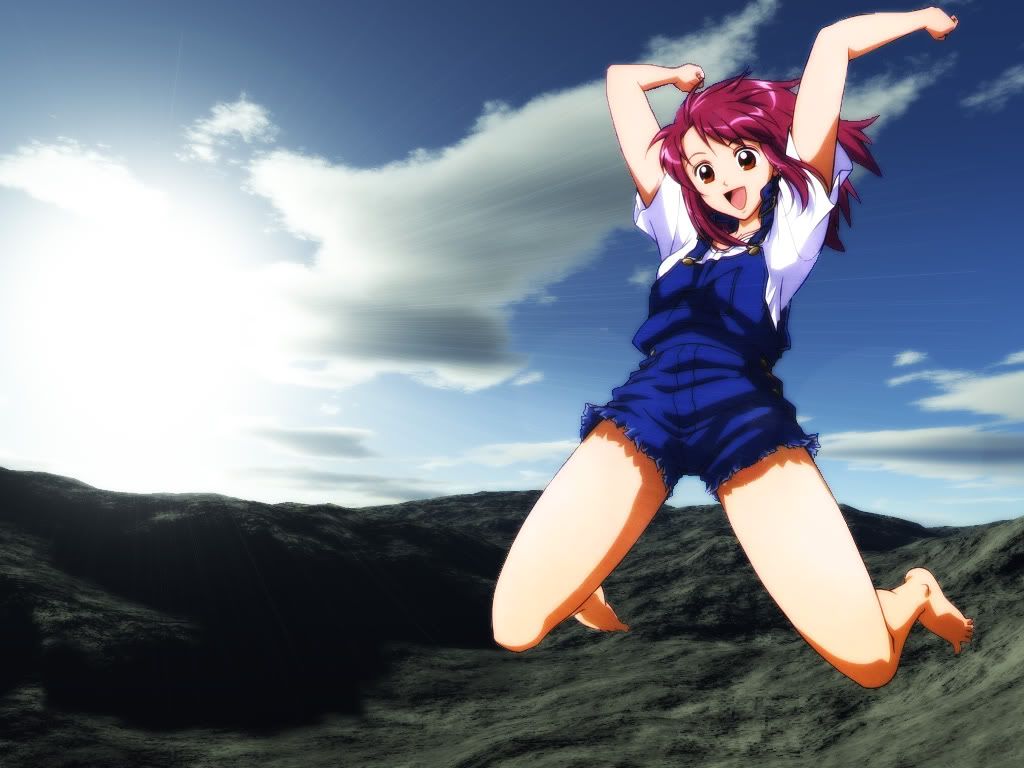
[sorry for being blunt. ^^"] i don't know why nobody has [pointed this out yet, but i think you need to see
the ground in this wall, because:
1. there's no way she she can jump that high [she's not looking down, you see[];
2. it feels so, i dunno, weightless? [lack of suitable vocab] it just feels uncomfortable that there's no focal
point in the whole wall expect for the floating character... i have no idea how to describe it; and
3. it'll fill up some of that big "empty" background.
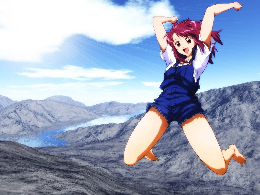
you don't have to make it complicated, just a simple horizon silhouetted against the sunset, of treetops, or a
city, or a field, or a cottage, anything. that's what you need to add to your 1st version to perfect it. and just
tune up the saturation a bitty for the sunset sky, it looks more like dawn, because it's so pale.
keep working on it, you've done a great job extracting so you shouldn't waste your efforts. i hope i've
helped! *thumbs up*
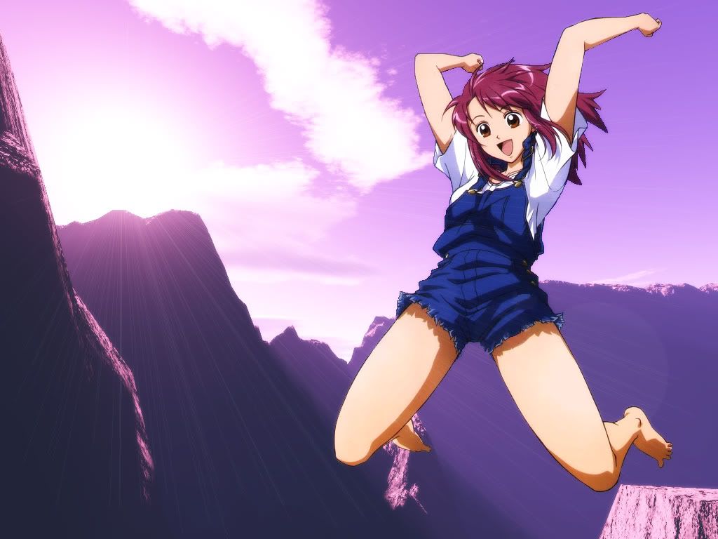
p.s. i don't like the 2nd version, for the reasons bluSake described above. xP


