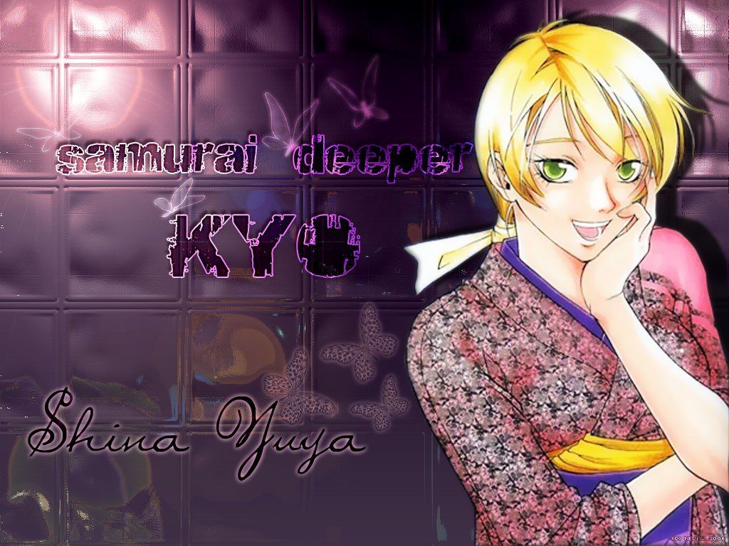
I like the 3D glass tile effect, very cool...though it looks a bit off with the chara. However, I think the problem here
is that you tried to fill up too much space. Composition is just as much about using empty space as filling it in. Some
pointers:
* There's too much text, and it's too big. Text gives structure, but too much of it can look clunky. What I
suggest is that you erase 1 of the liness, preferably the "Samurai Deeper Kyo," since that's heavier.
* The butterflies look too...transparent. As such, they look like they were added to fill space, but were not well
integrated into the scene. The bg is so 3D and realistic, why not try some more realistic brushes?
Hope this helps. :)


