Warning: Undefined array key "HTTP_ACCEPT_LANGUAGE" in /var/www/minitokyo/www/includes/common.inc.php on line 360 Mikan - Airgear wallpaper - Minitokyo

Mikan - Airgear wallpaper

page 1 of 1 6 total items

Nucleous

Nucleous

I will be taking you to.....

I've started this wallpaper sooo long ago it's not even funny and forgot all about it and found the .psd on my HDD two days ago and tried something with it.

This is what I have sofar it locks lot I know but have no clue what to do with it, I am going to clean up the sign in the corner and was thinking of cleaning and making lines sharper on the huge white Air Treck in the background but the overall background seems dull to me and am at a total loss I have no idea what to do. X-O

Thanks in advance for the help.

http://i68.photobucket.com/albums/i8/Nucleous1982/Airgearwallpapercopy.jpg

SMILE, even through your tears!!!!!
Life is not Measured by the number of Breaths we
take, but by the Moments that Take our Breath Away.

akari-chan

akari-chan

59 luv XD

I think the ides of this wall is good, but i think Mikan is a little dirty. So you should clean her up a bit. I don't think you really need the glow around her either. Well, good luck!

Signature
	Image
*~Latest Submissions~*:
{Relaxation}{Melancholic Yuki}{Basil}{Potemayo}

Regenbogen

Regenbogen

Somewhere over the Rainbow...

Hmm... well first of all if this is supposed to become a wallpaper you must change the formate of the wallpaper... or else it can never be used as a wallpaper.

The white lines... I cannot really see what they are?

So if this is meant to be a wallpaper there will be even more space on the left... You could add another character... or you can try around using a stock photo, using brushes, different photoshop options there are so many... it is mostly about trying around really... I think the idea with the lilac squares looks okay... and also that you put the white lines on it... the contrast of lilac and white works nicely. So if we try to think further on this first idea... why don't you add some of these lines... but they should make sense. Maybe you can find a stock photo and vector (done with pentool) the outlines of a skating area or some other surrounding... or some buildings... but so far the lines do not make sense to me. And if you wanna stick to such lines... sense making or not, they should look a little more clean and regular.

I would also change the AIRGEAR logo... do you know how to vector it? Or otherwise simply use another font... I'd make it white too so that it fits better to the white lines.

The rolls at the very bottom look a bit jerky...

Apart from that I really think your wallpaper could look nicely... you already have ideas... :) You just need to develop them a little further. Good luck with it and I hope you'll have some fun too... after all this should be the first reason for making wallpapers. :)

Signature
	Image

The text is a little too blurry, and the outlined rollerblades are a) too large to the point of being hard to figure out what they are and b) a little rough. Also, the wheels on her blades are a little choppy.

MapleRose

Retired Moderator

MapleRose

likes rainbows :D

actually the resolution that you have there is accepted according to the policy.

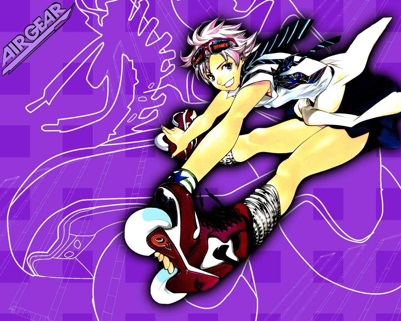
anyway, about the wallpaper. First of all, I find the colour to be too bright/vivid. But that's probably because I prefer something more muted on my desktop so I can see the icons...

I think your composition looks all right, and the white vector lines in the background is a neat idea, though maybe instead of making them white, try a light purple? So that it doesn't contrast too much and take your focus away from the scan. The lines are slightly jagged and could be worked better. I see some people are having trouble recognising the shape, so maybe you could change the texture instead the rollerblade area, or make it a slightly different shade or something.

Also, the patterning in the background is a good idea, but I feel the blocks don't really fit with the image. The image that you've used is really dynamic, so how about making rays coming from behind her pointing outwards? I don't think you need to use too many brushes or anything like that, 'cause that'll just clutter things up.

As for the outer glow, I have no problem with that.

hope that helps! :)

Nucleous

Nucleous

I will be taking you to.....

Thanks for the comments everybody I'll take the advise and work on it some more!

SMILE, even through your tears!!!!!
Life is not Measured by the number of Breaths we
take, but by the Moments that Take our Breath Away.

page 1 of 1 6 total items

Back to The Sandbox | Active Threads | Forum Index

Only members can post replies, please register.

Warning: Undefined array key "cookienotice" in /var/www/minitokyo/www/html2/footer.html on line 73
This site uses cookies. By continuing to browse the site you are agreeing to our use of cookies. Read more.