
Desperately in need of help at the moment,I thought it looks okay but now it looks as though it's too
simple..so..please comment and criticise all you want..
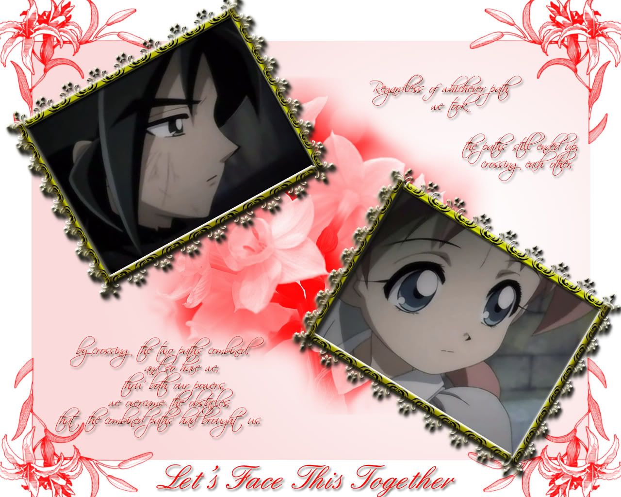
Let's Face This
Together
page 1 of 1 9 total items
-
It doesn't hurt to have company by your side.
- Currently watching: Hakuouki Shinsengumi Kitan, Wagaya no Oinarisama
- Dec 07, 2006
- Gallery
- Anime Watchlist
-
hahax..! princess tu tu..! i think it's quite okie..! just the frames of the pics dun really match red..! and the back of the wallie is white right, hmm...maybe do some abstract on it, i think i'll look nice but that's a suggestion..! ^^ if you wan more help you can ask a gallery mod, and the text fints are too fancy, maybe something less fancy would be nicer. yup thats all..! >.< hope that helped..!

- Dec 07, 2006
- Gallery
-
umm..lets see..
i like it..
the frame look nice but its seems not that fit into the background >_< need find the right frame for it >_<
And The back is look simple and nice but yeah,like norine-chan said, it do need some abstract at there..^^ to fill that out(its quite empty there.. >.< )

My Latest Artwork: Oofuri<3
DEAD- Dec 07, 2006
- Gallery
-
Nice..but like rika and norine said,the frame does not match with the background
 ~Live within your soul~
Join: Gakuen Alice FCElemental guardian
- Dec 12, 2006
- Gallery
-
Alright....i love it, it's really detailed and cute...but i really think that it's missing something....but what...?
~LoVeYlOvEy~
- Dec 12, 2006
- Gallery
-
Hi FutatsuNoNegai :)
I'll go through this point by point so here we go:
- Integration of scan and background
The fact that the background is this red and the scans are completed separated and framed away from the background is making them not speak to each other. To be honest, the pictures in the frames can be any pictures, and the background could have been any background- if that makes any sense.I think it may be a good idea to possibly look at the wallpaper again and rethink "what is my message here? Did I select the right images to convey this message, and if so, does my background complement that?" (that's for future reference btw, not directly at this wall ;))
-Background
The flowers in the corners are of a very different quality to the ones in the center. And then those flowers are of a very different quality to the flowers on the golden frames. It's best to keep things consistent so everything seems to be in sync :) Perhaps this might be something to consider o.o (?)- Text
It's best not to include so much text. I think that the biggest text down the bottom is enough for the whole wallpaper's message to go through and the rest of the paragraphing could work as a good segment of your gallery description :)-Borders
I generally say this to everyone, but borders are very hard to work with. Especially since the computer screen itself is a frame ^_^'-Colours
I think this aspect could be worked the most. The colours in the scans are very dark, yet the background is incredibly light (white with some reds). It's always best to stick with the colours of the scans :)-Scans
And it's always best to choose scans that aren't cut off. I'm not sure if you cropped these to this kind of size (it's still fine), but the placement of these scans look like photographs and would ask for a more realistic background (like a place where you would find these photographs).Overall the quality of the wallpaper is really good! <3
I hope that my comments have given you a few ideas- if so, yay! - and if you don't like what you see, then just hit undo and reconsider other possibilities :) Hope it was of some help!
*cookies* :D
Misa|Virtuoso and Legend of W.A.R - UA|Most coordinated Legion of W.A.R
MINITOKYO-WIDE KNOCKOUT WALLING COMP: LAUNCHES MARCH 2010. ONE WINNER. ONE PRIZE.
ADD ME TO YOUR FRIENDS <3- Dec 12, 2006
- Gallery
-
well it's not a bad wallpaper, though I'm not to sure about the framing of the pictures it looks a little over the top and is the wrong colour.
The words are rather cool, though again not to sure about them being red.
All the flowers are a bit miss matched but thats not to bad.
The images are also a tiney bit to dark . . .especialy compared to the bright colour of the rest of the wallpaper!
- Dec 12, 2006
- Gallery
-
Thanks for the advices!I'll work on it right away...and try to get it right this time!Thanks!
It doesn't hurt to have company by your side.
- Currently watching: Hakuouki Shinsengumi Kitan, Wagaya no Oinarisama
- Dec 12, 2006
- Gallery
- Anime Watchlist
-
^^ your welcome.
- Dec 15, 2006
- Gallery


page 1 of 1 9 total items
Back to The Sandbox | Active Threads | Forum Index
Only members can post replies, please register.