
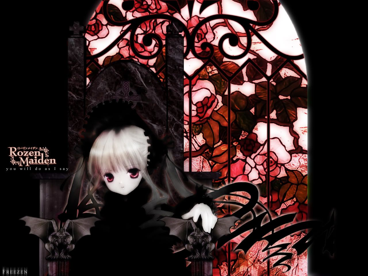
I apologise for showing you this lousy piece of work, but it's also why I need some criticism. Any kind soul please tell me what I need to work on, thanks!
page 1 of 1 10 total items
I apologise for showing you this lousy piece of work, but it's also why I need some criticism. Any kind soul please tell me what I need to work on, thanks!

wow thats pretty! I like that soft look you have going on with the character.
-I would probably take out the 2 gargoyles in front of her though, because the lighting on them is all wrong, and they
look too realistic. They also dont really match well with the whole "sweet gothic" kind of feeling that the
wallpaper has.
-The Rozen Maiden text looks a bit pixelly and low quality compared to the rest of the wall, but you could probably
leave it like that and get away with it.
-The chair looks pretty cool, except the marble is a little distracting. again, like the gargoyles (i seriously dont
know how to spell gargoyle..lol) it looks a little realistic compared to the rest of the wall. I would maybe overlay it
and put a gaussian blur on the bottom layer? Im not really sure what would work.
-darken the stain glass window in the back. Perhaps you can duplicate the layer, set the top layer onto multiply, and
gaussian blur the bottom layer? The gaussian blur might help because it also look a bit low quality
hope that helps!

avatar and sigimg by - kawaii-chicken the greatness
-Somehow it looks like shes missing her body bc its all the same color black.
-I agree with starr, take the gargoyles out it doesnt match.
-Maybe you could bring more color in her.
just wondering... should i take out the marble of the chair? cause then it'll be black... argh! i realy dunno what to do about the chair...
[edit]
okay I kinda changed some part... darkened the marble, gave her clothes more colour, but the stained glass is a bit of a
prob... but anyways

So is it for better or for worse? (the stained glass is a pain to look at >_<)
I don't know now. Maybe is my eyes. But her hair look like it were badly extracted :)
but, now without gargoyles it looks better imo :)
...::The only easy day was yesterday::...
yea, the stained glass is a bit bright now. is that on overlay or multiply?
I would filter the marble texture or give it a bit more gaussian blur to make it fit in better. I wouldnt take it out though, because it does look good
the only suggestion I can give for the background stained glass is to just vector it all and make the colros better and less bright.
avatar and sigimg by - kawaii-chicken the greatness
If you made the stained glass mostly dark, whish just a little like coming in at the top right, like maybe it's a streetlight or torch outside, it might look better. That way the colors of the window would still show but wouldn't overpower the girl. I like how creepy she is.
Ripping walls? You're headed to Banned-ville.

Its getting better, keep going!
i think you're giving more attention to the stained glass rather than shinku.
the glass is more eye-catching than shinku if i must say. :)
the glow is also off place and it's color doesn't match the whole work much.
but other than those ^
it's BEAUTIFUL. just make everything fit right! ;)

nyahhhhhh, finally got my lazy @$$ to start working on this wall again after more than 3 months of procrastination. and
so...
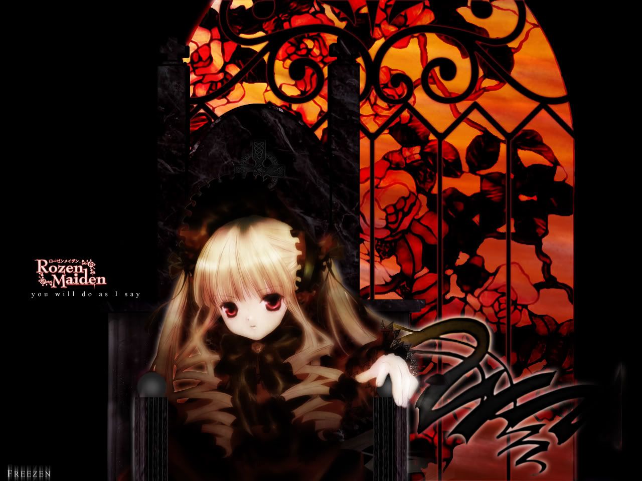
changed the stained glass quite a bit, attempting at a sunsetting feel, so i kinda changed the lighting on the girl
(shinku is it?). actually i made her less saturate in the previous tries to give her a more distant/superior, so
i'm not sure if by adding more onto her is for the better...
well, criticism is appreciated ^^
page 1 of 1 10 total items
Back to The Sandbox | Active Threads | Forum Index
Only members can post replies, please register.


