Hey Miku!
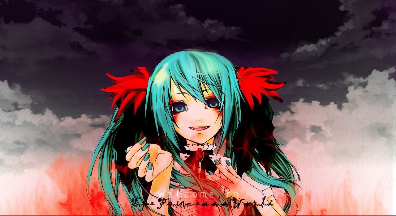
Okay, let's get started. Like Maplerose says, the colours do contrast a bit. And I find it a little weird that the
lines look so jagged.. Maybe you would want to clean that up? Maybe a little blur, careful smudging, repainting.. (which
was what I did for my wall). Some stuff seems to have been cut off to in the extraction, like the ribbon.. And the smear
of colour above her head doesn't quite look right. I think the best thing to do to fix that would be to extract/rub
that off and vector new lineart or something.
Hmm, the text is a little hard to see.. Maybe you could break up the title like
say, "Welcome to" at the left of her, and "The Princess World" at the right. And I think using the
same font would probably be tidier though the second font did look sorta cool, in a horror way.. But it's hard to
read with the dark sky bg..
But you know, I like your sky! And the flames too! Are they painted by you? It's quite well done! As to what to add
on.. for some reason I think of a large black raven perched behind her. ^^
Well, see you!


