
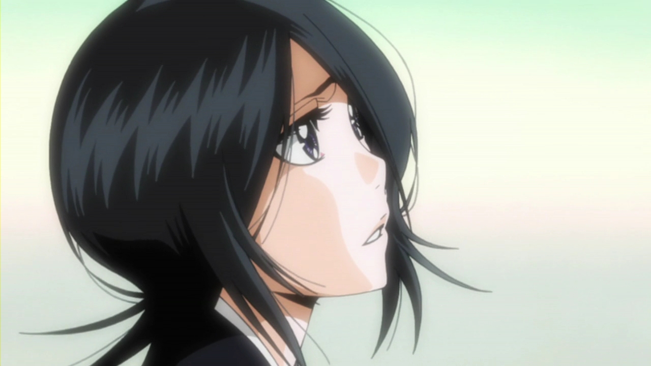
hi! so here it is... I did this
... and I'm not really satisfied... I vectored this screenshot and then added the background. the fact is,
I'm not good at doing stars ^__^"
still, I think it's finished but somehow, I find it lacks something and something is wrong, too... advices and
criticism are welcome! :D
Tagged under Bleach
This thread is closed for posting.
page 1 of 1 6 total items
-


- Currently watching: Beelzebub, Boku no Hero Academia
- Oct 24, 2011
- Gallery
- Anime Watchlist
-
Moreover the style you chose to vector the screenshoot, it's totally different from the one you chose for made the background o.o
The first is really "cartoon", the second is really "realistic"...
A suggestion could be to change the style background, and try something more similar to the vector...DeviantART YouTUBE MiniTOKYO FACEBOOK PAGE
GROUPS:

- Oct 24, 2011
- Gallery
-
I see! so that's what annoyed my eyes! xDD lol
ok, I'll try smthg! thank you. I'll update it later
- Currently watching: Beelzebub, Boku no Hero Academia
- Oct 24, 2011
- Gallery
- Anime Watchlist
-
Raffachan is right. Its either you make the BG unealistic or make the Rukia vector look less cartoony by using thinner lines... good luck! ^_^

I ♥ these groups:


Follow my blog for more disappointment!- Oct 24, 2011
- Gallery
-
As people had already pointed out - pick a more anime/manga-like background in order to blend those two better and make those lines thinner. But in addition to that, I'd also add better lighting/shading. Not sure if she's looking at the moon or being illuminated by it, but it seems the moon is behind her and way too close/big, making the whole perspective kind of odd. Maybe if you made the moon smaller, it would look better? And yeah, if the moon is behind her, the majority of her needs to be more in shadows, with only her edges highlighted by the light.
Yah, this has potential so keep it up!

- Currently watching: Gintama
- Oct 24, 2011
- Gallery
- Anime Watchlist
-
thank you very much alenas and josephine12cute! it'll be very helpful! xD I'll try to improve it and post an update today if I manage to do it... :D
merged: 10-25-2011 ~ 12:03pm
so, I reduced the number of the stars... I roughened them... I added shades to the sky and I "tried" to light it... but still... ^____^" ah, and I arranged the lineart! :D and I didn't know what to do with the moon... so :merged: 10-25-2011 ~ 03:38pm
so, a friend of mine told me to blur a bit the stars 'cuz it looked like "dots" only... well, I tried and:
- Currently watching: Beelzebub, Boku no Hero Academia
- Oct 25, 2011
- Gallery
- Anime Watchlist


page 1 of 1 6 total items
Back to The Sandbox | Active Threads | Forum Index
Only members can post replies, please register.