Warning: very long post ahead and hopefully helpful thread necroing c: Bolded
the sections so they'd be easier to follow
The hands aren't that bad looking, IMO, it all depends on how detailed you
want to make them: just the outline or adding knuckles, skin lines, nails (with shine and whatnot) etc. Here's a
pretty good tutorial: Hand tutorial by alexds1, but you can find a
lot on DA if this one isn't good for you (just search for "hand (drawing) tutorial").
Concerning the lineart, "smooth" is a bit vague. Are you referring to
quality or shape? Quality-wise, your best bet is to use the Pen Tool to either vector or stroke it. For stroking, make
sure to use the Brush option and set it to at least 75% hardness (size depends on how thick you want your lineart to
be). Alternatively, check out this tutorial: Cleaning Scanned Lineart if this is what you're
aiming for.
Shape-wise, I'd suggest using less anchor points (if you're using the Pen Tool) and working with the curved
parts of the lines more. For example, if you want to outline the top part of a character's head, 3 anchor points
are usually enough to get a smooth curve. The more anchor points you have, the less control you have over how round or
flowing the lineart looks. Lots of anchor points should be used only when you have a lineart that changes direction very
often - lots of small flowers, jewelry, hair strands etc. - otherwise use the minimum possible.
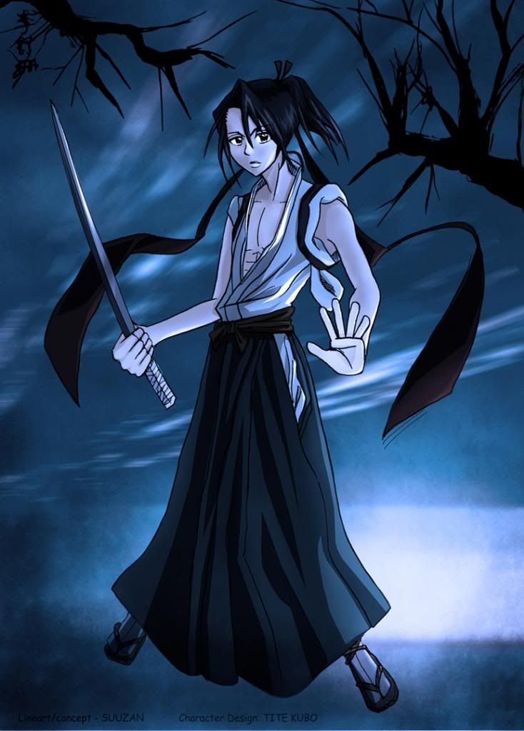
For the second drawing, I'd suggest placing him in an large, empty room
(lol, the opposite of what Kurorisa suggested XD) and emphasizing his "powers" by drawing light wisps and
effects around him, like he's powering up or something (IDK, I'm not familiar with Bleach). You already drew
him in a powerful pose, so there's not really any need to pile up lots of elements around him, let him stand out
instead. You can also try darkening the corners of the wallpaper gradually so that it doesn't look too empty or end
too abruptly.
As for the crashing, maybe PS is set to not use a lot of memory. Go to Edit ->
Preferences -> Performance and you'll see the two options you need to change: "Let PS Use..." and
Scratch Disks. For the first, drag the arrow until you get a value that's optimal for you (I currently have it at
70% or 1179mb* for 4gb of memory). For the scratch disks, select one (or how many you want) - preferably not the one you
have Windows and other programs on, and one that has a lot of free space. If you choose a disk with little free space,
you may run into the problem of not being able to save your files (you get a message along the lines of "Scratch
Disks are full.") when working with large files and not restarting PS from time to time.
After making the changes, click on OK. It may require a reboot of the computer, not just restarting the program, before
the settings take effect. Before I changed the settings I used to get freezes and lag all the time; now, I can open
400mb+ files and work as fast as I want to.
Aside from technical specs, the more raster layers** you have in your file, the bigger it will be. Sometimes, when
vectoring, even deleting the original image (raster layer) from the file will make a difference of 70mb in terms of
filesize, depending on how big it is (I normally work with stuff around 5000x7000px).
* this is the current available memory, as there are other programs open as well.
** the ones you paint on; as opposed to these, shape and text layers are vector-based, which means you can resize them
anyway you want and they won't lose their high quality.