Warning: Undefined array key "HTTP_ACCEPT_LANGUAGE" in /var/www/minitokyo/www/includes/common.inc.php on line 360 Motoko Nightscape - Minitokyo

Motoko Nightscape

Tagged under Ghost in the Shell

page 1 of 1 3 total items

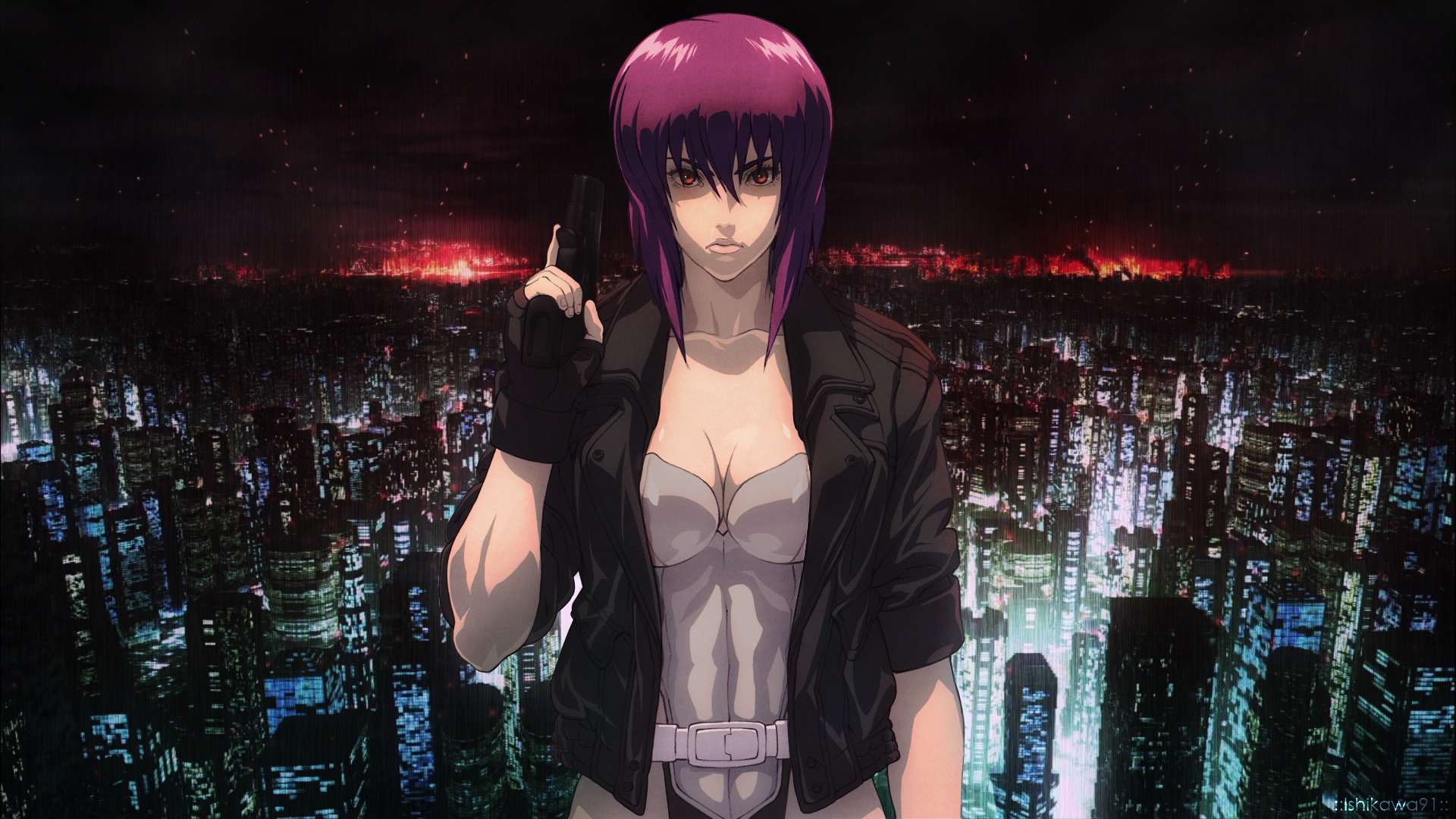
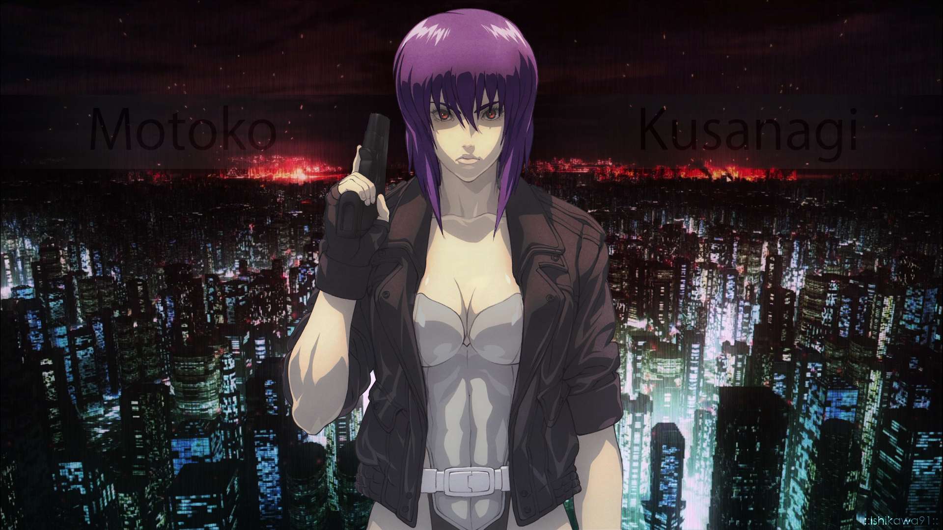
Ok so I had my first wall submission in a while reject. Guess I am rusty :) I thought I would post it here and see if anyone can give me some pointers on what it needs. I am having trouble blending Motoko into the background to make it feel like she is part of the background. I felt it needed some text, but I guess it doesn't work? I tried blending it in so it would be subtle and going with a font that IMO gives a GITS feel.


Current Version:

Spoiler (show)


http://imageshack.com/a/img911/4833/xJ7FI7.jpg

What I have done so far:
I took a scan, cut out Motoko and colored her in individually (hair, eyes, skin, gun, jacket, shirt, pants). I used a GITS cityscape background but heavily edited it to make it look more real and darker. I also added a subtle rain affect. I put in her name to fill in some of the empty space around her. But I think I may remove this entirely.

What I am going to do now:
I will most likely remove the text completely. I will clean up the pixels around her gloves (I assume this is what the mod meant by hands as I do not see any white pixels by her actual fingers). Not sure how to handle the belt comment, I only colored in the scan, I wanted to leave the art style untouched. So guidance here would be appreciated. Regarding blending her in, I like her in the center but maybe I should move her off to one side. Does anyone think that would help at all?


Any assistance would be much appreciated! I really want this wall to make the gallery.


Comments from the rejection were the following:

Quote: Specifically, there are issues regarding the quality of the resources you used. The render of Motoko is pixelated in certain areas, like around her belt. The lighting is also off, and she doesn\'t look like she is part of the scene (she is too bright for the background). There are also minor extraction problems (white pixels) around her hands and jacket (the ones on the hands are obvious, but the ones on the jacket are negligible).
Scan used
Background used

Valuna

Retired Moderator

Valuna

Naughty Artist

Tip for rendering and getting rid of those awful white parts or outlines that go brigher (brighter thing usually makes it look bad). Once you're finished up rendering nicely, for a finishing touch, you can use inner glow, set the mode on normal and pick an outline color along with it just taking 1-2px. It'll make it more consistent in it's colouring and will take away that 1px dot you missed out on.

Blending is a real issue in your wallpaper. Everything doesn't blend in together, making it all look seperate. You simply do this by using filter layers, brushes, gradients, ocapacity and blending modes. If you look at your background, if someone was standing there, then that someone needs to be "lighted" by those same colours. It looks dark, so it would be natural you somehow make her slightly darker and perhaps use a color that also goes with the lights. There is also a very dark sky with red in it. Putting some reds over her would do the job.

Thing with blending is, you don't just blend the render with the background, you also have to blend the background with the render. This way, it'll fit the best. So don't forget to change the background accordingly for the right fit!

Then there is a final thing you could add with the blending is the lighting (a picture usually has one lightsource). Read a little up on it aswell as blending to get the right idea. Hope it helps. I wish you luck.

These beautiful, fragile days are reborn, unfaded
Signature
	Image

Awesome, that gives me a great place to start. I will definitely take what you have said and post another version soon. Thanks for replying!

merged: 12-07-2015 ~ 04:12am
Ok I went ahead and tried some things. I removed the text, I think it looks cleaner without the text. I added the glow and went and cleaned up the render slightly. How is this for a second take? (I am sure there will be a few more revisions) Does it look like Motoko blends in more this way. I added some more contrast to her to make her darker. I also added a red filter. Picked some of the blue-green to her bottom right and brushed a light glow on her jacket and arm. I did the same thing on the other side but chose a dark green. Its fairly subtle on that side. I think it may be too subtle. Suggestions regarding that?


Here it is:

Spoiler (show)


http://imageshack.com/a/img905/6295/naWcuS.jpg

page 1 of 1 3 total items

Back to The Sandbox | Active Threads | Forum Index

Only members can post replies, please register.

Warning: Undefined array key "cookienotice" in /var/www/minitokyo/www/html2/footer.html on line 73
This site uses cookies. By continuing to browse the site you are agreeing to our use of cookies. Read more.