Warning: Undefined array key "HTTP_ACCEPT_LANGUAGE" in /var/www/minitokyo/www/includes/common.inc.php on line 360 Is my new K Project wallpaper good enough for MT or not? - Minitokyo

Is my new K Project wallpaper good enough for MT or not?

page 1 of 1 6 total items

So I made a new wallpaper for my own computer and I'd like to share it on MT but I'm not sure if it is acceptable or not. ^^'
Can you please have a look at it and tell me what you think about it?
*under the spoiler*

Spoiler (show)


http://orig13.deviantart.net/f561/f/2016/015/c/1/off_duty_by_alice666-d9o1mgk.jpg

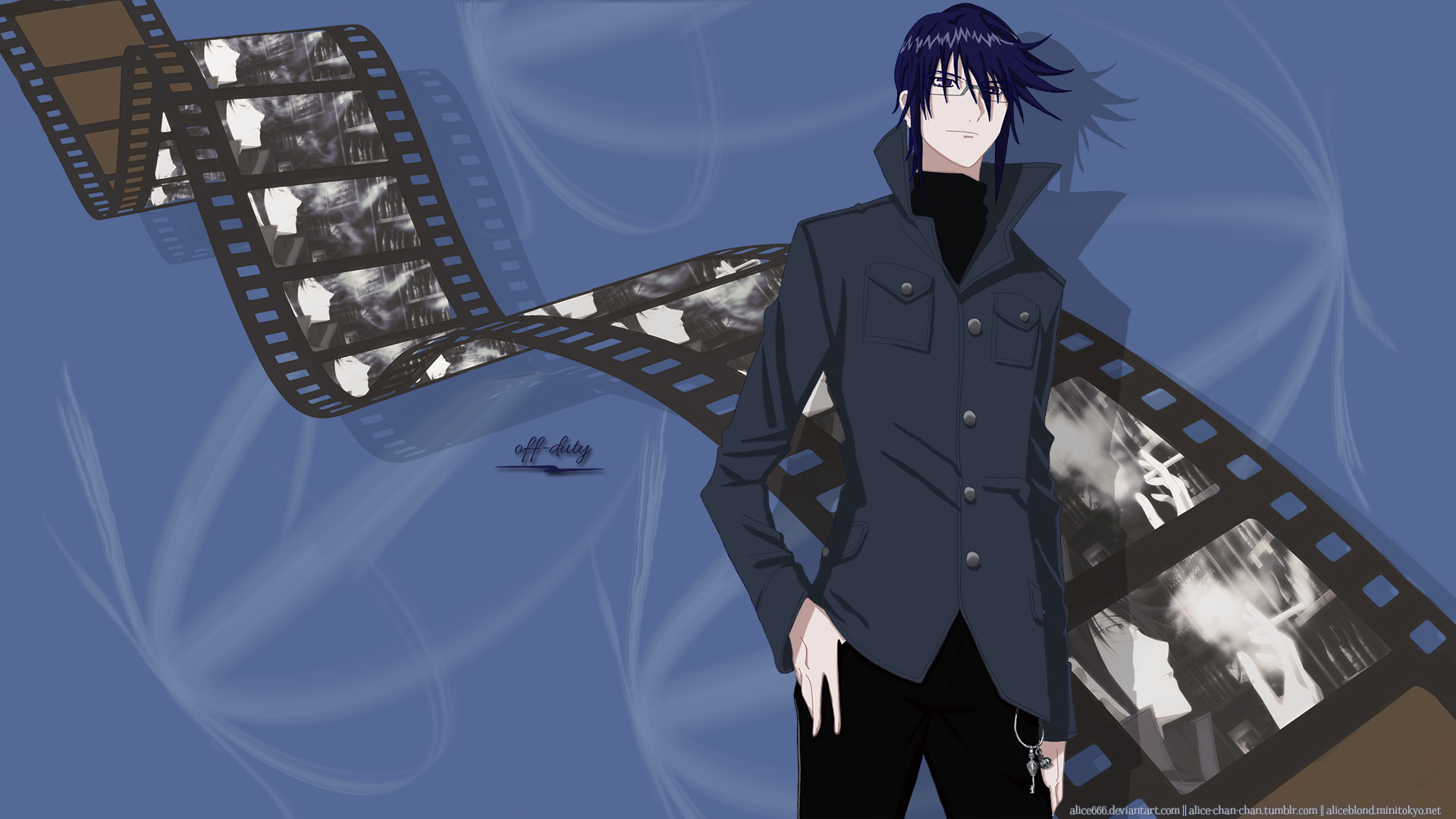
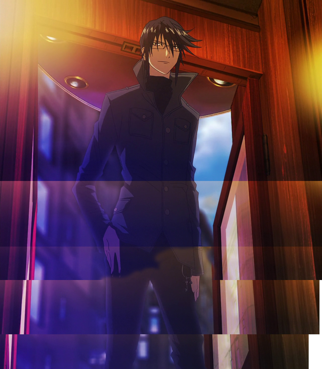
I compiled a bunch of anime screencaps to restore the image I wanted to vector. As the guy in the pic moves a little and the lighting also slightly changes that compilation picture looks rather messy. Here it is:
https://40.media.tumblr.com/503f1ce6b9e72425232ea9b80da44e94/tumblr_o10htlDz0p1sra23wo1_1280.jpg
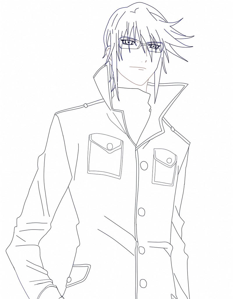
Then I vectored it and colored according to my liking. I changed the direction of the light and it's not falling from behind anymore. I had to use **my own scan** to vector the guy's keychains bcos I wanted to get a more detailed image of them. I also had to redraw some minor parts, like the guy's right hand bcos his finger looked as if it was cropped, so a friend suggested to draw this missing finger.
I also used my own scan (see the link above) as reference.
I used **this pic** to make the video tape. I've found it on the net, the site seems to be down but the picture is still available.
The pictures on the tape are screencaps, lots of them, with minor differences. ^^
Some abstract brushes were used for the background. I suppose I can find their source and link to it if necessary.
All in all, I wanted to make something simple and not very flashy, and I am more or less pleased with the result but I have no idea if my work can pass or not.

current anime obsession: K Project (since 2012)

Monu-chan

Retired Moderator

Monu-chan

Vector seems to have lots of jaggies (not 100℅ sure if it's thaaat much, because viewing the wallpaper on phone) I would suggest you to use gradients on his clothes, hair skin etc. It'll breath some life in your vector. The outlines of hair seems a bit too even, did you used strokes for outline?
I liked that video tape, it's looking really nice and the slight changes in screenshots looks good.
However I found background too simple (empty too), maybe playing a bit with gradient and some more abstract brushes for more color and depth will help in making BG look nicer. Not sure about texts, it looks off to me, maybe some more solid font will look good than curvy one, not really sure though maybe completely removing them will be better?

Anyway, what does mad mean exactly? Aren't we all a little mad?
Don't we have to be somewhat mad just to go on living, to go on hoping?
Signature Image

Thanks for sharing your opinion.
I used the "curve" type of SAI's vector tool to make the vector. The "line" type tool wasn't used at all. I tried my best to be as close to the lines of the source as possible but had to redraw some small parts, just as I've stated in my original post.
Are you sure that my vector has lots of juggies? Several people I've asked told me it wasn't that bad. =/
At first I wanted to apply some textures on the clothes and maybe hair as well but then I decided to simplify my plan. I am not sure about gradients though. But maybe I'll try to play with textures to see what I can get.
And as for background, I believe I've said this before, I wanted to make something minimalistic because too complicated wallpapers put too much stress on my eyes as well as distract my attention when I look at my desktop in need of clicking an icon. I think that having some patterns created by brushes is enough, more brushes, or textures, or gradients will probably make the background kinda disturbing. By the way I used all of these for my previous wallpaper:
http://static.minitokyo.net/thumbs/36/26/671336.jpg
not sure about gradients, I don't remember if I used them or not but I had at least several different textures and brushes applied to the backgroud that time.
I got tired of using my previous wallpaper pretty soon. That's why I wanted to make something less distracting this time.
And to be honest, the video tape is the part I am the least satisfied with. I believe I could do better. But I spent about 15 hours, 3 evenings in total to make this wallpaper (including working on the vector) so I don't feel like making any significant changes and spending some other 10-15 hours on it. x)
To conclude, the current version of this wallpaper is good enough for my own desktop and has some positive feedback on tumblr but I still don't know if I can submit it here or not.

current anime obsession: K Project (since 2012)

Monu-chan

Retired Moderator

Monu-chan

I wasn't trying to insult you or your wallpaper. Sorry if I sounded like that.
Yup, viewed your vector in pc as well, and yes, it has jaggies, vectors are supposed to be get rid of jaggies and they should be clean and crisp (unless you apply lots of filter which eventually leads to ruin vector cleaness. But you didn't applied filters, so they problem is of course something else)
Here I pointed out some of most visible jaggies when it's on 75% zoom. http://i.imgur.com/M2bI1Eb.jpg
You can use textures, they are good for creating depth, but I do think for your simplicity it'll look off (not sure but you can always try! ;3)

There're lots of wallpapers with interesting background but are not hurtful to eyes or create crowds. This Wallpaper is perfect example of it, even the colors are of same hue. Because right now, your elements (BG, tape, and Munakta) aren't blending to form a single image, it still looks like all 3 are copy pasted together....
D:
And yes, if you're satisfied with your result, then it's best for you. You do not need to change it unless you really want. I know making wallpapers takes lots of time, most of my vectors take 20 hours and are done in several weeks.

I'm still not sure if your wallpaper will be accepted here, a mod will answer this best.

Anyway, what does mad mean exactly? Aren't we all a little mad?
Don't we have to be somewhat mad just to go on living, to go on hoping?
Signature Image

Oh, now I can see what you were talking about. Well, it must be tiny bits of the coloring layer that I failed to erase because didn't notice at all.
Here's the upper part of my vector, with all the other layers turned off:
https://41.media.tumblr.com/fa23e54d4fd3f7b0e43889b6f7d5166a/tumblr_o1ivjfkiB21sra23wo1_1280.jpg
it covers about a half of places pointed out by you but I guess this pic shows that without the coloring layer the lines are pretty much OK.
So, at least 1 problem is figured out: I need to clean up the coloring layer and remove everything that invades the outer space. I will do this when I have enough free time. Thanks for bringing this to my attention! At least I can get read of some obvious mistakes and update the file.

current anime obsession: K Project (since 2012)

Emeralis

Emeralis

Self proclaimed Sugar Monster

I think the vector is great and the film reel with anime screenshots is a great idea.

This is probably your intention but I would finish the film reel at the top left. And it's very minuscule but I noticed some gaps here & there for the screenshots.

Spoiler (show)

http://i.imgur.com/iIjskmJ.jpg

I'd suggest using textures for the background (I recommend http://sanami276.deviantart.com/ and http://sirius-sdz.deviantart.com/ but there's TONS on DeviantArt).

Signature
	Image

page 1 of 1 6 total items

Back to The Sandbox | Active Threads | Forum Index

Only members can post replies, please register.

Warning: Undefined array key "cookienotice" in /var/www/minitokyo/www/html2/footer.html on line 73
This site uses cookies. By continuing to browse the site you are agreeing to our use of cookies. Read more.