Warning: Undefined array key "HTTP_ACCEPT_LANGUAGE" in /var/www/minitokyo/www/includes/common.inc.php on line 360 SOTW 16 & 17 - Minitokyo

Group announcement by S20-SignatureStudio

SOTW 16 Winner

Lacus
6 votes
Starr
0 votes
Thingperson
1 votes
Melymay
2 votes
Rikka
1 votes
Devildude
5 votes

Only members can vote.

page 1 of 1 15 total items

ChopperDave

ChopperDave

Likes Gundam too much

Ok, here are the sigs for SOTW 16, please as always USE THE POLL TO VOTE! >.<

Pinkprincesslacus:
http://i63.photobucket.com/albums/h158/PinkPrincessLacus2/Signatures/SakurSiggycopy-1.jpg

Starrliteangel:
http://img.photobucket.com/albums/v288/starrliteangel/bakuretsutenshisig2.jpg

Thingperson:
http://i29.photobucket.com/albums/c285/thingperson2/new%20photos%202/fortriplet444-1.jpg

Melymay:
http://i25.photobucket.com/albums/c95/melymay/SOTW16-fatestaynightMASSACRE.jpg

Rikkablurhound:
http://i76.photobucket.com/albums/j40/Rikkablurhound/Siggy-S20Fire.jpg

Devildude:
http://img226.imageshack.us/img226/6426/devsig4hm6.jpg

Voting will end: January 8th, 2007

SOTW 17
Theme: Heroes
Deadline: January 10th 2007
No bigger then 500x200
No animation
No ripping of others

melymay

melymay

Abomidable Snow-Woman

Oh yay, I submitted my sig on time :D :D :D Me so happy XD

Ahem.. Anyways, I vote for DD ^^ Nice and colourful.. That girl looks like she's naked though >_> But other than that, nicely done :)

ChopperDave

ChopperDave

Likes Gundam too much

Actually mely, you were a day late...but I dont feel like disqualifying you so I just went with it :P

Devildude

Devildude

- Alstroemeria Records -

no worries, we are both one day late.
My vote goes to... .... ... ... ... (are you ready?) ... ... ... ... Melymay...
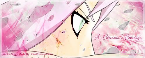
the reason: While it occurs to me she looks blurred and fuzzed, she looks rather.... emm busy. The render or whathever was in front of her at the bottom makes it look like a few blades of grass there, that could do without I believe.
Take in mind that text in a sig should be minimal, because a canvas so small, the text may look too big. Most people prefer small text to prevent from making it look too gawdy, in this case, it is. Two different texts font are also a critical sin for most sigmakers as they make it very hard to appreciate the beauty for they take too much attention. Colors are also important.

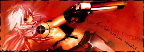
This sig takes a metallic textures like feel for the background, the character however contrasts it. Loud text but character silent. I would say it is either a good thing or a bad thing depending on your direction and intention. I highly suggest better color choosing, most people would prefer neutral colors to prevent from blending errors. In this case, it does a wee bit. I suggest using a majority of the same colors on the character itself, for example, for saber, blue or black would be fantastic. Nice blood splat tho.

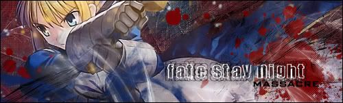
Although I have much complaints, the sig has the best composition among all, while giving close attention to being neither too plain or too busy, it balances but the overall effect needs more work.

PPLacus:
I enjoy vector sigs, but this one looks too neutral, I can barely see the instances where you seem to make attention for the pink tones.
The face looks.... empty, otherwise staring blindly into one direction... I seem to see more instances of using renders (3D) effects on the whole sig, which is rather compromising since vectors are more matching with textures. A good try, perhaps try it textured next time. I suggest more colors since this one is too neutral, and definitely some blending would be nice, otherwise the vector looks out of place. Text could have been better, try something called text blending, different colored text than that of the color of the main layer may give more flavor and make it look visible to a certain extent that is not as hidden or too loud in shapes and sizes.

StarLite:
Alright, it is one of my favorite scans from Ugetsu Hakua. Similiarly, it is also hard to blend an image with just blurring, in this case, I notice the use of motion blur. Try to brush and smudge the blending to become more flowing from the render of the character.
A plain colored background with some unique cracks on the wall makes it look rather flat. I can't tell whether or not you are trying to make her stand out or rather to blend her in cause this sig says it both ways. I suggest better choosing of colors to further match skin color, since she looks rather too red. Blending is yet again, important to fuel the sig with vibrantness and coolness.
Cool render but poor mixing, better luck next time.

Thingperson
Is it just me or why does cagali's face look like it is inscribed with nearly invisible numbers and words...? is this scan bleeding? If so, it is highly suggested that extreme effort be exercised to clean the surface of her skin and then blending blurring it to make it look more presentable. Or simply: another type of scan.

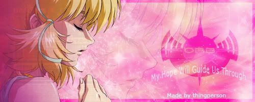
I think this time, I will say the background is good, keeping choices of colors pink means there is lesser errors to look for in a background where everything looks more synchornized. I however, feel that it cuts short if you want a more 3 D feeling from it. The adjustment layers options in PS allows you to alter the shadows on the background and the character, this way, you should be able to make more clean scans, as well as giving it a more finesse touch.

Rikka...
hmm... I dun wanna hurt your feelings but the texture on her face and the text is really... well unsatisfying.
reason why I feel that way is the white textures makes her look like a splatter onto a wall full of paint... (funny idea is that what Mr.Bean did in the series one time) she looks a flat spray paint image on a wall whitewashed with bleach like that.

Yet because of the image you choose, you gave it color, and at the same time, overly brighten on it makes it so much more vibrant, however, it all falls down when you look at the composition, one cannot understand whether or not you want a movement in your sig (in this case, movement comes on the right, and flatness goes to the left end).

The words, I am sure you see it, it is really overbrighten so badly by the layer of light that it is barely visible.

Click signature for my blog
Signature Image
The wind of destiny blows, and the descendant shall walk the earth once more...

OMG DEVILDUDE THAT WAS AWESOME! SO MUCH BETTER OMG *claps* Im starting to really like you now with giving advice, compliment together in one nice job! :D. I really appreicate the hard effort, it will go a long way and help many I bet and not hurt anyone's feelings thankyou so much :D.

I'll try to use a texture next time and keep your advice im mind ;). Although, I do know how to Blend text and brushes. Because that whole background of that sig wasnt any 3D render brushes or program, yet a bunch of random collected brushes put in selected of placement layers all on Blended Effects modes :D, just to let you know I sadly dont have any Render program. I just used a stock layer with color alterations and filters of layers itself, and layers of pure colors on modes, and lots and lots of brushes together on Blending Modes. Im happy you sort of like it though :).

I will keep your nice advices in mind, I really appreiate the comment! Thankyou!

My vote goes for thingperson, her siggy is soft, simple yet colorfully pretty and cute ;).

~* Lacus *~

Signature Image A little birdy told you to .... FOLLOW ME ON TWITTER!

starrliteangel

starrliteangel

Rabi to rabu rabu <3

voted for Devildude. I love the colors! I think the outer edge of the girl can be a bit blurred so she blends in better because I see a little pixellation here and there, but other than that, everything looks awesome!

Signature Image
avatar and sigimg by - kawaii-chicken the greatness

akazookin

akazookin

Okinawan doughnut

i voye for melymayy! XD

nice colour combi :)
and i agree with devil-san about the whitish grass O_______O
but it does seem to depict motion of her hand?

anyways.. great job guys!
GANBATEE! Q(^^Q)

Signature
	Image

Rikkablurhound

Rikkablurhound

*Kero~! O_o

Voted for DD XD
Wow, its really nice XD
Mine sucks T_T *sobs*
Ill try to do better, I really appreciatte U're comment DD XD

Devildude

Devildude

- Alstroemeria Records -

oh yeah, a note is that smaller sigs means better chances of avoiding render vs canvas fill up. Lesser canvas space, lesser work, lesser place for gawdy over effects, lesser errors.

more space, more creative spot, more work to blend.

Click signature for my blog
Signature Image
The wind of destiny blows, and the descendant shall walk the earth once more...

ChopperDave

ChopperDave

Likes Gundam too much

I like longer sigs because I like to see a lot of whatever the image im using, it also forces me to take into account the whole sig so I can make sure everything is where it needs to be. That and it looks better IMO :P

melymay

melymay

Abomidable Snow-Woman

Thanks for the info DD :) Helped me make my next sig ^^ Here's my SOTW 17 entry.

http://i82.photobucket.com/albums/j268/melaniepar_/SOTW17-yondaimehokage.jpg

This by far, the most effort I've ever put into a sig .. I tried to give it that vector look XD

thingperson

thingperson

Elizabeth, Ruler Of All Bishies

Hey everyone

this is my entry for the contest dear dave helped me on signatures the other day and helped me on this one and totally turned it around where its so cool..but since he tweaked it..i didnt feel right submitting it..so heres my orginal image..oh but you should see the one he did..hehe

http://i29.photobucket.com/albums/c285/thingperson2/new%20photos%202/ajfklajklfd-1.jpg

http://i29.photobucket.com/albums/c285/thingperson2/new%20photos%202/ajfklajklfd-1.jpg

Well i hope everyone has a wonderful day and have fun..*hugs*.

~*Cagalli*~

All hail Queen Elizabeth, ruler of all bishies. Watch your back, you wanna-be's
My Husband's are Kaname, Tsuna, Ichigo, Naruto, Haji, Hei, Sebastian, Lee-Leng
and that is why my world is of silk sheets, imported champagne, and endless erotic delight..
Signature
	Image VISIT THE userpageskindesignss20-signaturestudiotag-licious AND JOIN US

Oh wowies, I love those entries Mely and sissy! OMG SO COOL! XD Im jealous *hugs to you both*. Dang mely you've gotton so much better in just such a short time, it impresses me so much, your siggys are always so interesting and unique I LOVE THEM. And sissy your siggys are always so pretty, with so much effort in them its amazing, I love to be surprised by your siggys each week ;). :D Great Job you two *high 5s all around*.

My SOTW Heroes Entry:

http://i63.photobucket.com/albums/h158/PinkPrincessLacus2/Signatures/NarutoSiggy-1.jpg

I hope you like it, I did stuff i usually dont, I played with lots of filters, stuff different to the scan, and I painted the bg and sky if even still noticable. Only brushes used were the dots on it, and i used very low opacity texture, i did alot of work o.O oh well If off to rest now. :D

~* Lacus *~

Signature Image A little birdy told you to .... FOLLOW ME ON TWITTER!

starrliteangel

starrliteangel

Rabi to rabu rabu <3

my hottie ^-^

http://img.photobucket.com/albums/v288/starrliteangel/blackcatsig.jpg

http://img.photobucket.com/albums/v288/starrliteangel/blackcatsig.jpg

btw...for those of you who havent read the manga or seen the anime, an eraser is like an assassin (sp?)

Signature Image
avatar and sigimg by - kawaii-chicken the greatness

Those are some really nice entries! I really do like them all! Great job you guys!

!~* Best Friends Forever = Kaisui Tatsu ~ thingperson ~ PinkPrincessLacus *~!
Administrator of FFVV and Make-a-Friend
Signature Image

page 1 of 1 15 total items

Back to Group Announcements | Active Threads | Forum Index

Only members can post replies, please register.

Warning: Undefined array key "cookienotice" in /var/www/minitokyo/www/html2/footer.html on line 73
This site uses cookies. By continuing to browse the site you are agreeing to our use of cookies. Read more.