
Uploaded this wallpaper a long time ago, and today I just saw in my inbox that is deleted xD I kept wondering,why?!
Leaving this apart, need some suggestions about what to do with it and why has been deleted xD Sankyuu~
Tagged under Kiddy Grade
This thread is closed for posting.
page 1 of 1 11 total items
-

- Currently watching: Steins Gate, Kamisama no Memo-chou, BLOOD-C
- May 25, 2011
- Gallery
- Anime Watchlist
-
The idea and brushes and style is actually all pretty nice :D The only suggestion I can think of is to somehow make the character blend into the BG. As she is now, it looks like she was just sorta pasted there and recolored to match the coloring of the BG. If you maybe add some textures to her or make the BG appear to be growing from her it'll look a lot nicer ^-^
Also, since the character is placed at the side, the huge gap with just BG looks a bit odd. It's too empty, there needs to be something going on there asides from the BG circles and what not.
One thing you MIGHT want to do (but totally optional and just an idea) is add some other colors. She has lipstick right? It'd be cool if you made just her lips and lipstick like red or something, I dunno, just add some other colors? Her outfit could be a different color, or the BG could be a mix of alt. colors and such. Just flavor it up! :D
Overall very nice wally though, great style etc. good work ^-^
- Currently watching: Another, Sankarea, Sword Art Online
- May 25, 2011
- Gallery
- Anime Watchlist
-
Mm, were there any details on why the wall was deleted? :s
Not a bad concept though. A possible reason it was deleted could be the very slight jagginess of the lineart.. Was this your own extraction or a vector png? Some png files look jagged when resized ^_^; You could try using the blur/smudge tool on low opacity on the lines...Agree with all of duhqueenmoki's ideas, it would look better if she was more blended into the background. Also, this is just a small suggestion but wouldn't she be covered by desktop icons there, on the left?
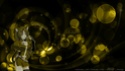
Occasionally, mods delete a wall because the background looks like just a copy+paste of a stock/brushes.. Provide links to resources? :3 I think I recognise the bokeh stock ^_^"Catch on fire with enthusiasm and people will come for miles to watch you burn" ☆.。・ ψ( ^ω^ )ψ ・°☆


Current fandoms: 999 (aka Nine Hours, Nine People, Nine Doors) // Dangan Ronpa // Persona 4 // Gakuen Kino --- From my cold! Dead! Hands!- Currently watching: Dokuhime, Dogs: Bullets and Carnage, Until Death Do Us Part
- May 26, 2011
- Gallery
- Anime Watchlist
-
Quote by duhqueenmokiThe idea and brushes and style is actually all pretty nice :D The only suggestion I can think of is to somehow make the character blend into the BG. As she is now, it looks like she was just sorta pasted there and recolored to match the coloring of the BG. If you maybe add some textures to her or make the BG appear to be growing from her it'll look a lot nicer ^-^
Also, since the character is placed at the side, the huge gap with just BG looks a bit odd. It's too empty, there needs to be something going on there asides from the BG circles and what not.
One thing you MIGHT want to do (but totally optional and just an idea) is add some other colors. She has lipstick right? It'd be cool if you made just her lips and lipstick like red or something, I dunno, just add some other colors? Her outfit could be a different color, or the BG could be a mix of alt. colors and such. Just flavor it up! :D
Overall very nice wally though, great style etc. good work ^-^
Your ideas really inspired me! <33 Thanks a lot! :3 I'll try my best now xD
Quote by aozoraskiesMm, were there any details on why the wall was deleted? :s
Not a bad concept though. A possible reason it was deleted could be the very slight jagginess of the lineart.. Was this your own extraction or a vector png? Some png files look jagged when resized ^_^; You could try using the blur/smudge tool on low opacity on the lines...Agree with all of duhqueenmoki's ideas, it would look better if she was more blended into the background. Also, this is just a small suggestion but wouldn't she be covered by desktop icons there, on the left?
Occasionally, mods delete a wall because the background looks like just a copy+paste of a stock/brushes.. Provide links to resources? :3 I think I recognise the bokeh stock ^_^It is an vector, and I'll try what you said about it :3 And about where to place her, you're right xD And yep, the BG's I used it was stock xD
Thankies for the suggestions <33- Currently watching: Steins Gate, Kamisama no Memo-chou, BLOOD-C
- May 26, 2011
- Gallery
- Anime Watchlist
-
Haha, stock images are nice but be careful, the wally may be deleted for low effort D:
Keep up the good work! :D And be sure to update the sandbox with your progress!
- Currently watching: Another, Sankarea, Sword Art Online
- May 30, 2011
- Gallery
- Anime Watchlist
-
Well, I did what I can do xD
And I did more versions of it <3
Ver1

Ver2

What do you think?!Can I submit my work?xD- Currently watching: Steins Gate, Kamisama no Memo-chou, BLOOD-C
- Jun 04, 2011
- Gallery
- Anime Watchlist
-
I think the new revisions are great but it's reeeaaallly low quality. The font is nice but not clean, everything looks like it was made too big or something. If you're able to make it not look pixellated/blurry/low quality then I think you're set to go! :D
- Currently watching: Another, Sankarea, Sword Art Online
- Jun 04, 2011
- Gallery
- Anime Watchlist
-
- Currently watching: Steins Gate, Kamisama no Memo-chou, BLOOD-C
- Jun 04, 2011
- Gallery
- Anime Watchlist
-
The text looks nicer in your current revision... although honestly, I feel that it did not have any changes at all, in my opinion... (I'm sorry if I might sound harsh or anything)
I'll go straight to the point(s):
- duhqueenmoki adviced you to make her blended with the BG... while you did well in making her fit with this bokeh stock, it seems she's not still blended with BG... it just seems she's pasted over the bokeh stock/s you used
- the tribal-like brush behind the typography seems weird... it doesn't suit the cute-sy image of Eclair and the bokeh
- try using a different font.. the typography in this is too similar...
- while the character placing is nice and the typography is there, the wall is still "empty"... considering its such a big size... the bokeh BG is there, although Eclair and the BG doesn't seem connected/blended like what I mentioned...but don't take my opinions seriously, they're just my... opinions... :P
the final look of the wall will still be your decision ;)
I ♥ these groups:


Follow my blog for more disappointment!- Jun 05, 2011
- Gallery
-
I like vers2 more :) but you should upload both either way. Anyways, for improvements I can tell you really wanna stick with that BG so (xD) I guess there's nothing else you can do. Maybe, to make the character part of the BG, you could add some of those bubble things to the front of her, just like her lower half.
- Currently watching: Another, Sankarea, Sword Art Online
- Jun 06, 2011
- Gallery
- Anime Watchlist
-
Wahh, okay xD Thanks for the opinions <33
I'll be busy with school this week, I'll do it this week if it's okay :3Hope this time is at your expectations xD I tried my best :3
Click here! <3merged: 07-02-2011 ~ 03:48pm
Well, can I submit my work now? xD- Currently watching: Steins Gate, Kamisama no Memo-chou, BLOOD-C
- Jun 08, 2011
- Gallery
- Anime Watchlist


page 1 of 1 11 total items
Back to The Sandbox | Active Threads | Forum Index
Only members can post replies, please register.