
hello, mt wallers , i am having problem wheter this wall good enough to be submited to mt ,
MY wall
: vector, brush, texture
if it not good enough, can you give me suggestion how to fix it, to be not deleted. thank you
oh,, this the source of this wall source
page 1 of 1 10 total items
-
Man proposes. God disposes.

- Currently watching: Shakugan no Shana, Fate/Zero, Yosuga no Sora
- Dec 29, 2011
- Gallery
- Anime Watchlist
-
i'm Sorry, that page was not found.
can you upload it again ...
i prefer in photobucket or imageshack
^-^I can't be the best without you by my side, back07

- Currently watching: Omamori Himari, Pokémon, Maken-Ki
- Dec 29, 2011
- Gallery
- Anime Watchlist
-
oh my bad XD
please check it again...Man proposes. God disposes.
- Currently watching: Shakugan no Shana, Fate/Zero, Yosuga no Sora
- Dec 29, 2011
- Gallery
- Anime Watchlist
-
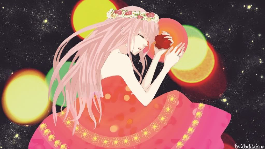
It's got a pretty concept. :) It's a bit small though, could you upload a bigger version so we can check for quality...?
I have a feeling some of the lemon brushes might turn out a bit too fuzzy in quality at higher resolution >_<
Ah and the more solid circles, especially the pink one - perhaps you can gaussian blur it at very low strength? :3 So as not to be too contrasting and eye-popping.I like the pattern you used for her dress..
As for the background, it's cool and starrish, but maybe you can use erm, a slight radial gradient to give it a pinkish/orangish hue, like Luka's colour scheme. ^^ Maybe use a separate layer, in overlay mode? Because the contrast is a bit too strong. xDKeep it up~
EDIT: Ah, I posted before you updated to a larger photobucket image; aw, the lemon brushes really are kind of fuzzy.. ^^;
"Catch on fire with enthusiasm and people will come for miles to watch you burn" ☆.。・ ψ( ^ω^ )ψ ・°☆


Current fandoms: 999 (aka Nine Hours, Nine People, Nine Doors) // Dangan Ronpa // Persona 4 // Gakuen Kino --- From my cold! Dead! Hands!- Currently watching: Dokuhime, Dogs: Bullets and Carnage, Until Death Do Us Part
- Dec 29, 2011
- Gallery
- Anime Watchlist
-
i think this is great..
but her hair isn't look good...
selection of it is less fit...
trimming might result if the selection would be betteri hope it can help...
sorry for my bad english..
^-^I can't be the best without you by my side, back07
- Currently watching: Omamori Himari, Pokémon, Maken-Ki
- Dec 29, 2011
- Gallery
- Anime Watchlist
-
thank you back07 and aozoraskies for sugestion , i will remake this one with more effort and i will try to follow your sugestion
Man proposes. God disposes.
- Currently watching: Shakugan no Shana, Fate/Zero, Yosuga no Sora
- Dec 29, 2011
- Gallery
- Anime Watchlist
-
Since it's of a smaller resolution, I also can't see many details but from what I can see is that you definitely need to work on the hair more - some parts are missing, some are very jagged and sharp looking and the overall shading looks quite messy, too. It seems vectored but I can't tell for sure, but either way, you need to work more on that hair.
I also agree that those circle brushes in the background look too fuzzy, blurry and pixelated so you might want to use better quality brushes. Keep it up!

- Currently watching: Gintama
- Dec 29, 2011
- Gallery
- Anime Watchlist
-
If i am correct the character is ripped and places on the desktop... redo it i can see the lines being bitten off :D either way its a good reminder :)
the background itself looks like a photo thats been printed on a sand paper.... i think that maybe colorizing or just adding more contrast would fix that... maybe :P
ahm those... apples. lemons.... what are they ? :D i also agree with ppl above me too blurry.Well good luck on finishing it. In overall just make sure the characters fits in the background instead of being glued to it :P
That which does not kill us makes us stronger
- Currently watching: Naruto
- Dec 29, 2011
- Gallery
- Anime Watchlist
-
Quote by darkkrisnathank you back07 and aozoraskies for sugestion , i will remake this one with more effort and i will try to follow your sugestion
ok ok..
i hope the next will be better..
:)I can't be the best without you by my side, back07
- Currently watching: Omamori Himari, Pokémon, Maken-Ki
- Dec 30, 2011
- Gallery
- Anime Watchlist
-
I don't know how to vector myself, but when I look at your wallpaper I can say that you need to work on hair. I think you had a mistake while rendering. Becuz some of hair parts are missing as alenas said. And if you add more shadow on the vector that would be better. As for the bg, I'm really really sorry, is not enogh either. Space looks like a stock image-i know it is not but it just looks like. And circle brushes are really pixelated and low quality. Dont understand my comment wrongly, you are better at me at any rate-I don't even know how to vector- but I just want to help you. I'm looking forward to see updates. Good luck :)
Epic fail :D

- Currently watching: Gakuen Babysitters
- Jan 19, 2012
- Gallery
- Anime Watchlist


page 1 of 1 10 total items
Back to The Sandbox | Active Threads | Forum Index
Only members can post replies, please register.