
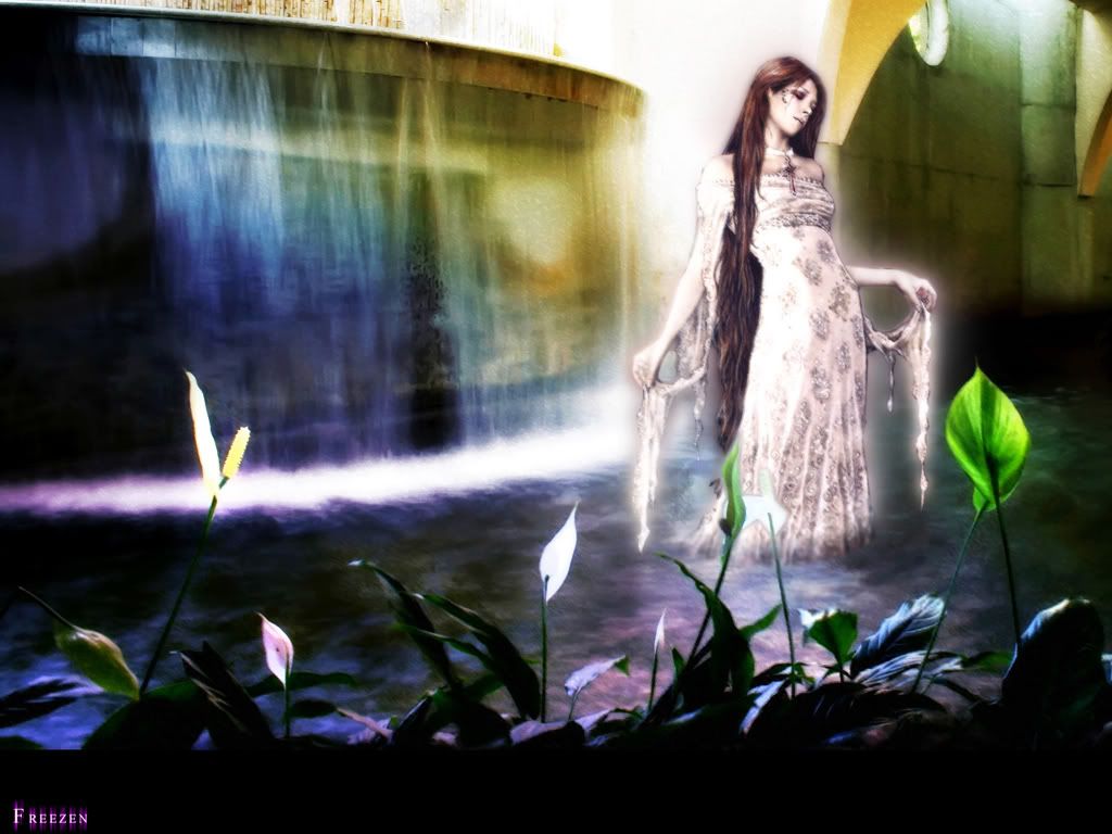
Well, I have 2 version of a wall that needs some critism (and choosing which is better). The difference is that ver2 is brighter and the use of smudgestick is more obvious. Yep, thanks!


page 1 of 1 9 total items
Well, I have 2 version of a wall that needs some critism (and choosing which is better). The difference is that ver2 is brighter and the use of smudgestick is more obvious. Yep, thanks!

Version 2 is a bit too bright for me, makes scan look more blurry too, why lose the details if it looks good with it?
:D
I do like the brightness of the water though.
Simple & Clean- Utada hikaru
:nya:
lol, thank you.
so what can i do to ver 1 to improve on it?
I'll stick to the first version.
Now, where is she supposed to be? From the background (right part), she seems like she's in a some kind
of...sewer... :x
If you can't handle me at my best, then you don't deserve me at my worst!
lol!
well i have no idea actually... i just saw this beautiful stock and decided to use it. maybe it's really a sewer
(although why will they have a fountain and plants in one...)
so... you reckon this is better? didn't do much changes except that i made her slightly brighter, and the glow
around her a bit more. yep.
version 3:
I like version 1 so far actually.
lol, she does look like she's in a sewer thing actually ^^; It's that wall thingy on the right side of the picture, and the ledge at the top of the waterfall.
I would move the waterfall up a bit, so that the ledge thing is cut off, and it looks more like a natural waterfall. Then remove that wall to the right, opening it up to make it look like she's outside. Put some sky and clouds and hills in the distance, and some mist flying up from the water.
Alternatively, you can get rid of the wall, and put some trees instead, and make it a sort of tropical jungle type setting :)
btw, that's a pretty stock image (of the woman), where did you find it?
 EGAO! Distant Destiny!:.:devART:.:PokeWalls:.:C&C:.:P-o-R:.:Vectory:.:DSC:.:Simple-ism
Join which?waller round
12!!
It's from aethereality.net, i believe it's from an artbook from a series called vampire chronicles (this sounds so... anne rice-ish) but pretty isn't she? i thought she was real when i saw the thumb. it was only on closer look that i realise she was a painting.
well, this is ver 4.

the lighting seemed very very wrong though... what to do... and it just doesn't seem right... too real and too
fake... argh! :(
okay, this is ver 5 which turn out wrong as usual.

learned the hard way that purple and orange doesn't fit, especially when i'm the one trying to manipulate
it.
the text, is really U-G-L-Y! but i have no idea what else to do with the black blank at the bottom. sigh...
so criticise =)
Much better :) I don't know why I had that feeling - maybe because the wall was dark?
I like the text and effects on it, you should leave those like that.
Something is wrong, though. You should make the shadows on the girl stand out more. The background is that of a sunset,
while the lighting on the girl looks like it's from the sun during the day (hope you understood what I wanted to
say ^_^').
And one last question: do you want your wallpaper to be more "shiny" or crisp, as in using textures?
If you can't handle me at my best, then you don't deserve me at my worst!
arh... don't quite get the last question... :x
made a new version again, mainly changed the back background to a more sunrise feel (hopefully that turned out right...), and then i changed the text again, adding alot of butterflies... does it spoils the wall? or should i just take out all the effects and shift the text to the center?
(and so presenting ver 6...)

(ver 7, text at center)

page 1 of 1 9 total items
Back to The Sandbox | Active Threads | Forum Index
Only members can post replies, please register.


